 Search Tips
NetworkMaterialCreate
The NetworkMaterialCreate node has been designed to contain your material network. The node features a left-to-right workflow and a new shading node design, which enables you to work more efficiently, making building and editing materials as quick and simple as possible. It holds the function of one or more NetworkMaterial nodes as well as the NetworkMaterialInterfaceControls node.
|
Control (UI) |
Default Value |
Function |
|---|---|---|
|
rootLocation |
/root/materials |
Defines the scene graph location where the material locations are created. The parameter options are available in either the scene graph widget or drop-down menu to the right of the parameter. For more information, refer to the Scene Graph Location Widget Type. |
|
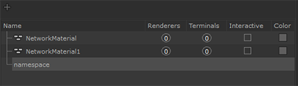
Add Namespace |
N/A |
Click to add a new NetworkMaterial location or Namespace.
Note: To learn more about multi-NetworkMaterial workflows in a NetworkMaterialCreate node, see Multiple NetworkMaterials with NetworkMaterialCreate. |
|
Material Scenegraph |
N/A |
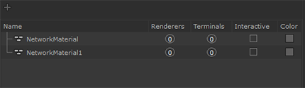
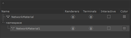
Add, remove and organize NetworkMaterials and Namespaces.
Use the middle-mouse button to click and drag NetworkMaterials and Namespaces to organize them.
Middle-mouse drag NetworkMaterial1 Note: You can place NetworkMaterials and Namespaces underneath other Namespaces but not underneath other NetworkMaterials. |
Node Parameters
|
Control (UI) |
Default Value |
Function |
|
parameters |
N/A |
Promoted parameters within the NetworkMaterialCreate node appear here. This section remains empty if no parameters have been promoted. Note: For more information on how to promote parameters, see Node Parameters and Interface Controls documentation. |
Interface Controls
|
Control (UI) |
Default Value |
Function |
|
|
N/A |
Click to add a new Interface Control and open its parameters. |
|
|
N/A |
Filter the list of Interface Controls by name or type. Type in the text field to start filtering. A list of matching controls are displayed. Click the Select All Matching button to display the parameters for all matching Interface Controls.
|
|
|
Disabled |
Toggles the display of the parameters. |
|
|
Disabled |
Adjusts the width of the Interface Control list so the full length of the control names are visible. |
|
|
Disabled |
Adjusts the height of the Interface Control list so all controls are visible. |
|
Note: The following parameters are only visible once an Interface Control has been created and is selected. |
||
|
state |
visibility |
The state of the parameter or page for the control to affect.
|
|
targetType |
parameter |
Select whether to apply the condition on either:
|
|
targetName |
N/A |
Specifies the name of the chosen parameter or page. Note: The name must be identical to the one displayed in the NetworkMaterial node's Material Interface. |
|
definitionStyle |
operator tree |
Selects how to set up the condition:
|
|
When definitionStyle: operator tree |
||
|
operators |
||
|
op |
and |
Select which expression operator to use in the operator tree:
|
|
ops |
||
|
Add |
N/A |
Select an op:
|
|
Note: The following parameters are only visible once an operator has been selected from the Add menu. |
||
|
op |
N/A |
The chosen op from the Add menu. |
|
path |
N/A |
Specifies the path of the parameter or page to evaluate. |
|
value |
N/A |
Specifies the values to compare the parameter or page values with, in order to evaluate if the condition is true. |
 Filter
  Disable Parameter Display
 Fit to Width
 Fit to Height
Material Interface
|
Control (UI) |
Default Value |
Function |
|---|---|---|
|
Name |
N/A |
A list displaying all promoted parameters, organized in the same way as they were grouped when promoted. |
|
Source |
N/A |
The path to each different parameter. |
Note: For more information on the uses of the Material Interface, see Node Parameters and Interface Controls documentation.