 Search Tips
Search is based on keyword.
Ex: "Procedures"
Do not search with natural language
Ex: "How do I write a new procedure?"
Types of Controls
The types of controls that can be found in Mari are listed in the table below. Each control is accompanied by an example image of how it appears in Mari, as well as a description of what it does and how to use it.
|
Controls |
What it looks like |
What it does |
How to use it |
Notes |
|---|---|---|---|---|
| Add attribute |

|
Lets you add an attribute to a property. | Click the icon and fill in the Add User Attribute dialog box. | |
| Buttons |
|
Lets you select a function. | Click it. | May show an icon or a word. |
| Checkbox |
 unselected, unselected,  selected selected |
Lets you select an option. | Click to select. | An x displays when selected. |
| Control sphere |
|
Lets you move a light around the scene. | Click and drag to pull the light around. | |
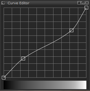
| Curve editor |
The Curve Editor
|
Maps between input and output values (45° = the same). Bar along the bottom displays the effect at each point. |
Add points by clicking on the curve or bar. Click and drag to move a point on the graph. Shift+click and drag to move multiple points on the graph. To select and deselect multiple points: • Shift+click the points. • Click outside the curve. To edit points: • Double-click the selected points and change their values. • Right-click the points and select Edit Points. You can also edit a single point using the same methods. To delete a point: • Ctrl/Cmd+click it. • Right-click it and select Delete Point. To delete multiple points: • Right-click the selected points and select Delete Points.
|
You can move, edit, and delete multiple points at once. |
| Dropdown list |
|
Lets you select from a list of valid values. | Click the down arrow on the right, then click to select an option. | |
| text field |

|
Lets you type an entry. | Click inside the box and type a valid entry. |
Often combined with a slider and reset button. When an text field has been combined with a slider to change values, click in the text field and press the middle-mouse button+drag up or down to increase or decrease the value. |
| Horizontal slider |

|
Slides along a range of valid values. | Click and drag left (more) or right (less). | Often combined with an text field (that shows the value) and reset button. |
| Incrementers |

|
Lets you increase or decrease a value. | Click the up or down arrows. | If you press Ctrl (on Windows and Linux) or fn (Mac) while pressing the up or down arrows, the number is increased or decreased by whole numbers rather than individual decimal points. |
| List |
|
Lets you select from a list of valid values. | Click to select an option. | |
| On/Off Indicator |
 on, on,  off off |
Shows whether an option is on or off | Look at it. | Often combined with a switch. |
| Option buttons |

|
Lets you select mutually exclusive options. | Click to select which option you want. | Circle is filled when selected. Sometimes called “radio buttons”. |
| Remove attribute |

|
Lets you remove an attribute from a property. | Click the icon, then click Remove to confirm. |
|
| Reset button |

|
Reset to the default. | Click the icon. | Often combined with an text field and slider |
| Swatch |

|
Displays the currently selected color, and lets you select a different color. | Click to select a color from the Colors Palette | |
| Switch |

|
Turns an option on or off. | Click and drag right (on) or left (off). | Often combined with an On/Off indicator. |
| Tabs |

|
Displays several groups of the same kind of information, such as different categories of brush tips in the Shelf Palette. |
Click: • a tab to view it •
•
•
•
|
|
| Thumbnail |

|
Displays a thumbnail preview of a selected feature or function. | Look at it. |


 button displays the Curve Editor in a pop-up window.
 to view the previous or next tab
 to add a tab
 to delete a tab
 to open the current tab in a separate window
Sorry you didn't find this helpful
Why wasn't this helpful? (check all that apply)
Thanks for your feedback.
If you can't find what you're looking for or you have a workflow question, please try Foundry Support.
If you have any thoughts on how we can improve our learning content, please email the Documentation team using the button below.
Thanks for taking time to give us feedback.