 Search Tips
Search is based on keyword.
Ex: "Procedures"
Do not search with natural language
Ex: "How do I write a new procedure?"
Display Viewport
The Display viewport offers you the ability to control how individual items appear within a 3D viewport, overriding the viewport style itself. To modify any of the item display properties, simply select an item within a viewport, or the Item List, and open the Display viewport panel. Depending on the type of item layer selected, slightly different options appear.
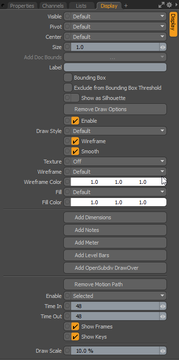
3D Mesh Items Display Options
The following options are available when working with 3D mesh items:
• Visible - sets visibility for the item itself in the 3D viewport. Default respects viewport settings, Yes sets the item as always visible, and No disables visibility entirely.
• Pivot - sets visibility for the 3D item pivot. Default respects viewport settings, Yes sets the pivot as always visible, and No disables pivot visibility entirely.
• Center - sets visibility for the 3D item center. Default respects viewport settings, Yes sets the center as always visible, and No disables center visibility entirely.
• Size - a multiplier that adjusts the display size of the item's representations for camera, light, and locator icons. This does not affect the representations of mesh layers.
• Label - typing in text for the Label displays the text positioned next to the 3D item in the viewport for easy identification. It also adds two additional properties to control the display of the label in the viewport: Show Label and Label Offset.
• Show Label - this toggle temporarily enables/disables the display of the label in the viewport without losing settings. This option is only available when a label is specified.
• Label Offset - this value specifies the distance away from the locator where the label appears. This option is only available when a label is specified.
• Bounding Box - when enabled, Mesh Items display as a simple wireframe box around the geometry's total volume, instead of displaying the geometry itself.
• Exclude from Bounding Box Threshold - when enabled, the item is not affected by the Preferences > Display > OpenGL > Bounding Box Threshold option. For more information, see Display Preferences.
• Show as Silhouette - when enabled, items draw only as a solid shape, with no interior details. For the purposes of animation, it can be beneficial to view certain elements as a silhouette to ensure that key poses are expressing certain information. This works in conjunction with the Enable Silhouette setting (described in 3D (OpenGL) Viewport) of the viewport display options, which must be enabled (the default state) for the silhouette to be visible.
Tip: The Show as Silhouette display option is only applicable to the Default viewport display mode.
• Add/Remove Draw Options - the Draw Options open/remove additional properties for adjusting how items display in the 3D viewports, when selected additional properties appear.
Note: This option does not work in the Default, Advanced, Gooch Tone Shading, Cel Shading, and Reflection viewport modes.
• Enable - toggles the display of the Draw Options without losing values.
• Draw Style - allows you to choose a specific draw style for an individual Mesh Item. The Default respects viewport settings.
• Wireframe - disabling the Wireframe checkbox disables the wireframe overlay on 3D Mesh Items.
• Smooth - disabling the Smooth checkbox disables the smoothing applied to polygon surfaces, making polygons appear faceted.
• Texture - controls the display of texture layers on a Mesh Item. Off disables texture display, Texture draws the texture without shading, which can make it easier to see a texture for painting, and Shaded Texture takes into account the shading of the surface to which the texture is applied.
• Wireframe - adjusts the draw color of the wireframe overlay of the 3D item in the 3D viewport.
• Wireframe Color - when Wireframe is set to Custom, the Wireframe Color sets the color of the wireframe.
• Fill - if Draw Style is set to Solid, this value controls the color of the 3D item's fill.
• Fill Color - when Fill Color is set to Custom, this value specifies the RGB color of the fill of the Solid in the 3D viewport.
• Add/Remove Dimensions - when this option is enabled, dimension values for the overall bounding box size appear in the viewport around the Mesh Item. An additional sub-tab shows in the Properties Panel, allowing further display customizations.
• Add/Remove Notes - when this option is enabled, you can define multiple lines of text (up to nine) that show up when the item is selected. An additional sub-tab shows in the Properties viewport, allowing further display customizations.
• Add/Remove Meter - when this option is enabled, you can display an on-screen analog-style meter graph (this looks like a speedometer) that can be rigged to show individual values in the 3D viewport. An additional sub-tab shows in the Properties viewport, allowing further display customizations.
• Add/Remove Level Bars - when this option is enabled, you can display an on-screen equalizer-type graph for visualizing multiple on-screen values. An additional sub-tab shows in the Properties viewport, allowing further display customizations.
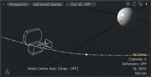
• Add/Remove Motion Path - displays the motion path for specific items within a scene (shown below for the camera item). You can select the Add Motion Path option, revealing additional properties controlling the display of the path in the 3D GL viewport.
• Enable - provides a means to toggle the display of the path On or Off, or to have the path only visible when the item is Selected.
• Time In/Out - Time In determines the number of frames before the current time in the Timeline that are displayed by the curve, while Time Out determines the number of frames after the current time that are displayed.
• Show Frames - when enabled, this option displays the position of the element at each frame as a small dot along the path. This can be useful to see how the element moves in time, but can also get busy for some types of motion and can, therefore, be disabled.
• Show Keys - when enabled, this option displays the position of the element at each keyframe as a white dot along the path.
• Draw Scale - determines the size of the resulting motion path in the 3D viewport.
Locator Display Values
Locators are instrumental in setting up controllers and modifiers for animation. Therefore, controllers have their own specific set of draw options, increasing their utility even further.
The following options are available when working with controllers:
• Visible - sets visibility for the item itself in the 3D viewport. Default respects viewport settings, Yes sets the item as always visible, and No disables visibility entirely.
• Pivot - sets visibility for the 3D item pivot. Default respects viewport settings, Yes sets the pivot as always visible, and No disables pivot visibility entirely.
• Center - sets visibility for the 3D item center. Default respects viewport settings, Yes sets the center as always visible, and No disables center visibility entirely.
• Size - a multiplier that adjusts the display size of the locator.
• Label - typing in text for the Label displays the text positioned next to the locator in the viewport for easy identification. It also adds two additional properties to control the display of the label in the viewport: Show Label and Label Offset.
• Show Label - this toggle temporarily enables/disables the display of the label in the viewport without losing settings. This option is only available when a label is specified.
• Label Offset - this value specifies the distance away from the locator where the label appears. This option is only available when a label is specified.
• Add/Remove Draw Options - the Draw Options control the look of the locator in 3D Viewports, used mostly when Custom Locator Shapes is enabled.
• Show/Hide Dimensions - when this option is enabled, dimension values for the overall bounding box size appear in the viewport around the Mesh Item. An additional sub-tab shows in the Properties viewport, allowing further display customizations.
• Show/Hide Notes - when this option is enabled, you can define multiple lines of text (up to nine) that show up when the item is selected. An additional sub-tab shows in the Properties viewport, allowing further display customizations.
• Show/Hide Meter - when this option is enabled, you can display an on-screen analog-style meter graph (this looks like a speedometer) that can be rigged to show individual values in the 3D viewport. An additional sub-tab shows in the Properties viewport, allowing further display customizations.
• Show/Hide Level Bars - when this option is enabled, you can display an on-screen equalizer-type graph for visualizing multiple on-screen values. An additional sub-tab shows in the Properties viewport, allowing further display customizations.
• Enable - toggles the display of the Draw Options without losing values.
• Wireframe - adjusts the draw color of the locator in the 3D viewport.
• Wireframe Color - when Wireframe is set to Custom, the Wireframe Color sets the color of the wireframe part of the locator.
• Fill - if Custom Draw shape is set to Solid, this value controls the color of the fill itself.
• Fill Color - when Fill Color is set to Custom, this value specifies the RGB color of the fill of the Solid in the 3D viewport.
• Add/Remove Motion Path - displays the motion path for specific items within a scene. You can select the Add Motion Path option, revealing additional properties controlling the display of the path in the 3D GL viewport.
• Enable - provides a means to toggle the display of the path On or Off, or to have the path only visible when the item is Selected.
• Time In/Out - Time In determines the number of frames before the current time in the Timeline that are displayed by the curve, while Time Out determines the number of frames after the current time that are displayed.
• Show Frames - when enabled, this option displays the position of the element at each frame as a small dot along the path. This can be useful to see how the element moves in time, but can also get busy for some types of motion and can, therefore, be disabled.
• Show Keys - when enabled, this option displays the position of the element at each keyframe as a white dot along the path.
• Draw Scale - The Draw Scale option extrudes a ribbon shape outward from the motion path that represents the orientation angle of the animated element. The larger the scale value, the wider the ribbon representation in the viewport.
Locator Shapes
Locator shapes allow you to change the default draw style of the locators in the 3D viewport. Since locators have so many uses, it may be necessary to make each unique for easy identification and selection. Modo can automatically draw a non-rendering element between an item and its child (links always draw to child items in hierarchies) as well. Links are a useful in creating visual representations of item associations in complex hierarchies.
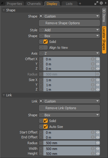
The following Shape options are applicable when working with locators:
• Shape - choose between the Default cross style, or choose Custom to enable additional properties for locator display customization.
• Remove Shape Options - this button removes the additional Shape options, reverting to the Default cross representation.
• Style - controls whether the Shape options draw in addition to the default value (Add) of if they replace its display (Replace).
• Shape - choose from multiple primitive shape options for the locator's representation.
• Solid - toggles between a filled or wireframe representation of the shape.
• Align to View - forces the representation to align with the viewport's camera.
• Axis - chooses the Axis for display of the shape representation.
• Offset - adjusts the offset values to position the locator representation.
• Radius - adjusts the size of circular locator representations.
• Size - adjusts the size of rectangular locator representations.
The following Link options are applicable when working with locators:
• Link - choose between the default value None, or a simple Line, or choose Custom to enable additional properties for link display customization.
• Remove Link Options - this button removes the additional Link options reverting to the default None.
• Shape - choose from multiple primitive shape options for the link representation.
• Solid - toggles between a filled or wireframe representation of the shape.
• Auto Size - dynamically scales the link shape, depending on the distance between the two items.
• Start Offset - offsets the start position of the link representation.
• End Offset - offsets the end position of the link representation.
• Radius - adjusts the size of circular link representations.
• Width/Height - adjusts the size of rectangular link representations.
Camera Display Options
Cameras are a virtual lens into the 3D world inside Modo and everything rendered is seen from the point of view of a camera. The camera display options can be accessed from the Display viewport or the Display tab in the camera's Properties viewport.
For a full description of the camera Display parameters, see Camera Display Properties.
Additional Draw Options
For all items, there are additional GL drawing properties that allow you to customize the UI for rigging in a number of ways. Options are toggled on/off with associated buttons in the Display viewport when the target item is selected, with an associated sub-tab that appears in the Properties panel.
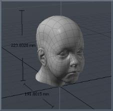
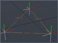
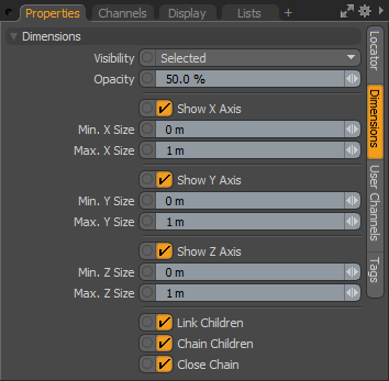
• Show/Hide Dimensions - when this option is enabled, an additional sub-tab appears in the Properties panel titled Dimensions. By default, dimension lines and values for the overall bounding box size appear in the viewport around a Mesh Item. The attributes in the Properties panel allows you to further customize the information that is displayed. Linking a series of items together through a hierarchy allows the display of distances between each object's Center point, from parent to child (and only when the parent item is selected do the dimension values display). Displayed dimensions are shown in the images below.
• Visibility - determines the visibility of the dimension lines with Off being not visible, On being visible, and Selected being only visible when selected.
• Opacity - controls the transparency of the dimension lines and numerical values displayed in the 3D viewport.
• Show X/Y/Z Axis - with these channels, you can individually control the display for each axis.
• Min X/Y/Z Size/Max X/Y/Z Size - the Min and Max values can be assigned for each axis and when the defined values for either Min or Max are reached, the dimension text displays in red in the viewport.
• Link Children - when set to true (the default option), this option draws the link lines to the child items. This is used to disable the dimension line linking if the behavior is undesirable.
• Chain Child - when set to true, this option draws dimension lines from child to child in hierarchical order, instead of from the parent to each individual child.
• Close Chain - when set to true, this options draws an additional dimension line link back to the parent item from the last child item.
|
|
|
Dimensions shown on a Mesh Item |
Dimension measurements |
|
|
|
The Dimensions panel in the Properties viewport. |
|
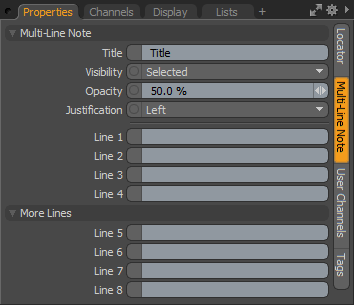
• Show/Hide Notes - when this option is enabled, an additional sub-tab appears in the Properties panel titled Multi-Line Note. This option allows for on-screen display of custom text strings for information such as instructions. The text is useful to Riggers and TDs, or just to add some helpful reminders for an item when selected.
• Title - the first line of text that displays above the Line entries.
• Visibility - determines the visibility of the dimension lines, with Off being not visible, On being visible, and Selected being only visible when selected.
• Opacity - controls the opacity of the dimension line and numerical values displayed in the 3D viewport.
• Justification - determines the justification of the text block so that text is set to Left, Center, or Right.
• Line 1-8 - text line entries that display in the 3D viewport.
Note: Display text can also be positioned with the Label Offset control.
|
|
|
Dimension measurement labels. |
The Multi-Line Note panel in the Properties viewport. |
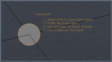
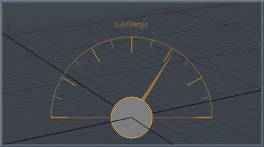
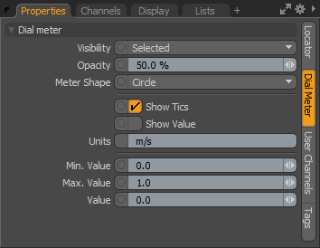
• Show/Hide Meter - when this option is enabled, you can display an on-screen analog style gauge graph (looks like a speedometer) that can be rigged to show an individual value in the 3D viewport. An additional sub-tab appears in the Properties panel titled Dial Meter that allows some customization of the display.
• Visibility - determines the visibility of the meter display, with Off being not visible, On being visible, and Selected being only visible when selected.
• Opacity - controls the opacity of the meter readout and numerical values displayed in the 3D viewport.
• Meter Shape - choose between a full Circle meter display and a Half Circle display.
• Show Tics - toggles the visibility of 15° and 30° interval lines in the display.
• Show Value - toggles the visibility of the Value information readout above the dial.
• Units - a text display that is positioned next to the Value display when the Show Value option is set to true.
• Min/Max Value - the Min and Max values determines the lowest value and the the highest value that is displayed in the on-screen meter, controlling the overall position of the Value needle.
• Value - this is the input channel that determines the actual value displayed in the viewport, as well as the position of the meter needle (relative to the Min and Max values). Additional rigging is required in the Schematic Viewport in order to connect the Value channel input from an output.
|
|
|
Analog meter displayed. |
The Dial Meter panel in the Properties viewport. |
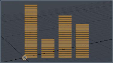
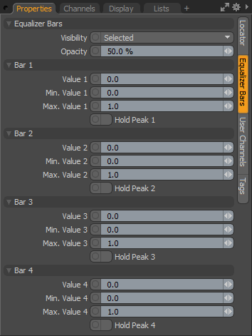
• Show/Hide Level Bars - when this option is enabled, an additional sub-tab appears in the Properties panel titled Equalizer Bars. This option is used to display an on-screen equalizer-style bar graph for visualizing multiple on-screen values, relative to one another. Additional channels show in the Channels Viewport when enabled.
• Visibility - determines the visibility of the level bars, with Off being not visible, On being visible, and Selected being only visible when selected.
• Opacity - controls the opacity of the level bars readout displayed in the 3D viewport.
• Value 1-4 - these are the input channels that determine the actual values displayed in the viewport, as well as the scale of the individual level bars (relative to the Min and Max values). Additional rigging is required in the Schematic Viewport in order to connect the Value channel input from an output.
• Min Value 1-4/Max Value 1-4 - the Min and Max values determines the lowest value and the highest value, per readout, that is displayed in the on-screen level bar, controlling the overall scale of the bar displayed.
• Hold Peak 1-4 - like an audio readout, when the Max value is reached for any Value readout, an indicator is drawn in the viewport. Toggle the Hold Peak value to reset the display.
|
|
|
Level bars meter displayed. |
The Equalizer Bars panel in the Properties viewport. |
Note: Up to eight bars total can be displayed by referencing the additional Channels available in the Channels viewport.
Sorry you didn't find this helpful
Why wasn't this helpful? (check all that apply)
Thanks for your feedback.
If you can't find what you're looking for or you have a workflow question, please try Foundry Support.
If you have any thoughts on how we can improve our learning content, please email the Documentation team using the button below.
Thanks for taking time to give us feedback.