Widgets and Hints
Hint Types
Strings and Numbers
Integer, float or string hint values should use the common literal
representation of such values (e.g. 1, 2.3, foo).
Booleans
Boolean hint values can be specified using true or false. For
historical reasons, the following strings are also accepted: yes, no,
on, off, 1, 0.
Lists
List hint values can be specified either using a delimited string or a nested
<hintlist> XML element. Strings are delimited using a pipe character
(|). The following two forms are equivalent:
<param name="someParameter" widget="fileInput" fileTypes="exr|png"/>
<param name="anotherParameter" widget="fileInput">
  <hintlist name="fileTypes">
    <string value="exr"/>
    <string value="png"/>
  </hintlist>
</param>
Child elements of <hintlist> may be of type <int>, <float> or
<string>, and may specify their value in either value or default
properties.
Dictionaries
Dictionary hint values can be specified using a delimited string or a nested
<hintdict> XML element. Items in strings are delimited using a pipe
character (|); keys and values are separated by a colon character (:).
The following two forms are equivalent:
<param name="someParameter" widget="mapper" options="a:1.0|b:2.0|c:3.0"/>
<param name="anotherParameter" widget="mapper">
  <hintdict name="options">
    <float name="a" value="1.0"/>
    <float name="b" value="2.0"/>
    <float name="c" value="3.0"/>
  </hintdict>
</param>
Child elements of <hintdict> may be of type <int>, <float> or
<string>, and may specify their value in either value or default
attributes. They must also specify a name attribute.
Common Hints
The following hints are applicable to most widget types.
Hint |
Type |
Description |
|---|---|---|
|
String |
Alters the display name of the widget.
Please use this rarely as it can create confusion with regards to
expressions and |
|
Boolean |
If true, the value of the corresponding parameter is not editable via the Parameters tab. This does not affect scripting. |
|
String |
Displays a line of informational text below the editing widget for the parameter. Please use this sparingly as the same mechanism is used for displaying error messages on some widget contexts. |
|
String |
The file extension to use for the temporary file that is created when External editor… is chosen from the parameter’s context menu. |
|
String |
See Help Text. |
|
Boolean |
If true, text in the editing widget is displayed using a monospace font. |
Pages and Groups
group
<page> and <group> elements use the group widget type be default.
It supports these hints:
Hint |
Type |
Description |
|---|---|---|
|
Boolean |
If true, the page/group is expanded in the UI to reveal its contents. |
|
Boolean |
If false, the page/group is expanded in the UI. Use |
presetsGroup
The presetsGroup widget type for pages allows you to define default values
for specific parameters that are contained in/on the respective group/page.
Defining a presetsGroup for a specific page results in a menu that displays
in the Parameters tab for the parameters.
Widget type-specific hints:
Hint |
Type |
Description |
|---|---|---|
|
String |
Specifies the parameter names for which to set default values, separated by commas. |
|
String |
Specifies the default values for the different presets. Each preset is
defined by a name and a list of values, one for each parameter specified
in the |
Note
Only floats, list of floats, and strings are allowed in the presets
attribute.
In the example below, the <page> element’s widget is set to
presetsGroup, and the element defines presets for four parameters:
Kd, Kd_color, ColMap, and
Ks. Each preset then contains four values: a float, a list of
three floats (color), a string, and a float. For instance, the preset called
Low contains the following values: 0.1,(0.1, 0.1, 0.1),"low_map",1.0.
<args format="1.0">
  <page name="Basics" open="True" widget='presetsGroup' policies='Kd,Kd_color,ColMap,Ks' presets='
      Low,0.1,(0.1, 0.1, 0.1),"low_map",1.0|
      Medium,0.4,(0.4, 0.4, 0.4),"mid_map",0.4|
      High,0.8,(0.8, 0.8, 0.8),"hi_map",0.5|
      MyPreset,1.0,(0.1, 0.2, 0.3),"Goofy",0.9'>

    <param name="Kd"/>
    <param name="Kd_color" widget="color"/>
    <param name="ColMap" widget="fileInput"/>
    <param name="Ks"/>
    <param name="Ks_color" widget="color"/>
    <param name="SpecularExponent"/>
    <param name="Ka"/>
    <param name="Ka_color" widget="color"/>
    <param name="opacity"/>
  </page>
  <page name="Textures" open="True" hide="False">
    <param name="SpecMap" widget="fileInput"/>
    <param name="RepeatS" widget="boolean"/>
    <param name="RepeatT" widget="boolean"/>
  </page>
  <page name="Bump Mapping" open="False">
    <param name="BumpMap" widget="fileInput"/>
    <param name="BumpVal"/>
  </page>
  <page name="Reflection">
    <param name="EnvMap" widget="fileInput"/>
    <param name="EnvVal"/>
    <param name="UseFresnel" widget="boolean"/>
  </page>
  <page name="Refraction">
    <param name="RefractMap" widget="fileInput"/>
    <param name="RefractVal"/>
    <param name="RefractEta"/>
  </page>
</args>
Basic Widgets
null
Parameters that are hinted with the null widget type are effectively hidden
from the UI: no widgets are created for them. No other hints are evaluated for
this type of widget.
number
Displays widgets for entering numeric values.
This is the default widget type used for number parameters.
Widget type-specific hints:
Hint |
Type |
Description |
|---|---|---|
|
Float or integer |
Specifies the minimum value when dragging on a parameter’s label. Values entered via the text field are not clamped. |
|
Float or integer |
Specifies the maximum value when dragging on a parameter’s label. Values entered via the text field are not clamped. |
|
Float or integer |
Specifies the label drag increment. |
|
Integer |
Specifies the number of digits to display after the decimal point. The default value of -1 indicates full precision. |
|
Boolean |
If true, floating-point parameter types are displayed as integers. This affects display and also applies clamping on numeric entry. |
|
Boolean |
If true, animation via curves is disabled. |
|
Boolean |
If true, a slider is displayed to the right of the text entry field. |
|
Float or integer |
Specifies the minimum value of the slider. |
|
Float or integer |
Specifies the maximum value of the slider. |
|
Float or integer |
Specifies the origin value of the slider. |
|
Integer |
Specifies a non-linear scaling of the slider. |
|
Float or integer |
Specifies the sensitivity of the slider. |
string
Displays a widget for entering text.
This is the default widget type used for string parameters.
Widget type-specific hints:
Hint |
Type |
Description |
|---|---|---|
|
String |
A regular expression whose matching values will be replaced upon text
entry. These characters are replaced by |
|
String |
Used with <param name="someParameter" replaceRegex="[^A-Za-z0-9_ ]" replaceWith=" "/>
|
checkBox
Displays a check box widget. When applied to string parameters, either Yes
or No are set as values. When applied to numeric parameters, either 0
or 1 are applied. It has no widget type-specific hints.
color
Displays a widget for picking color component values.
Can be used for number parameters.
Widget type-specific hints:
Hint |
Type |
Description |
|---|---|---|
|
Boolean |
Enable Filmlook visualization. |
|
Boolean |
Enable No-Filmlook colorspace. |
|
Boolean |
Restrict color components to the range 0 –> 1. |
scenegraphLocation
Displays a widget for entering and jumping to a scene graph location path.
Can be used for string parameters.
Widget type-specific hints:
Hint |
Type |
Description |
|---|---|---|
|
Boolean |
If true, relative scene graph location paths are allowed. |
|
String |
If defined, the Adjust Path Relative To <path> menu command is available from the widget. When chosen, the absolute path stored in the parameter is transformed to a relative path. The path is relative to the scene graph location stored in the parameter given in this hint. |
|
Boolean |
If true, the Adopt Scene Graph Selection menu command is available from the widget. |
|
Boolean |
If true, a warning icon is not displayed in the widget when zero paths are present. |
cel
Displays a CEL statement widget.
Can be used for string parameters.
Widget type-specific hints:
Hint |
Type |
Description |
|---|---|---|
|
Boolean |
See above. |
scriptEditor
Displays a multi-line text field for entering a script.
Can be used for string parameters.
Widget type-specific hints:
Hint |
Type |
Description |
|---|---|---|
|
Boolean |
If true, the size of the widget’s label is minimized. This gives the script editor more space at the expense of its left edge not lining up with nearby widgets. |
|
String |
If true, a Edit in External Editor button is displayed above the text field. |
|
String |
The syntax highlighter to use. Currently only “python” is supported. |
scriptButton
Displays a button that executes a Python script when pressed. All submodules
from the Katana module are available from within the script.
Additionally, the following local variables are available:
- parameter
The parameter object corresponding to the script button.
- node
The node object that owns the parameter corresponding to the script button.
- exit()
Exits the script button script.
Can be used for string parameters.
Widget type-specific hints:
Hint |
Type |
Description |
|---|---|---|
|
String |
The text to display on the button. |
|
String |
The Python script to execute when the button is pressed. |
Pull-down Widgets
popup
The popup widget displays a pop-up menu or combo box with literal choices
for parameter values. For example:
<param name="opacity" widget="popup">
  <hintlist name="options">
    <string value="0.0"/>
    <string value="0.5"/>
    <string value="1.0"/>
  </hintlist>
</param>
Can be used for string parameters.
Widget type-specific hints:
Hint |
Type |
Description |
|---|---|---|
|
List of strings |
This is the list of choices to be displayed in the pop-up menu or combo
box. It may be specified as a child <param name="someParameter" widget="popup" options="a|b|c"/>
<param name="anotherParameter" widget="popup">
<hintlist name="options">
<string value="a"/>
<string value="b"/>
<string value="c"/>
</hintlist>
</param>
|
|
Boolean |
If true, the pop-up menu will instead be displayed as a combo box which
supports direct text entry of values not in the options list. This can
also be done by using <param name="someParameter" widget="popup" options="a|b|c" editable="true"/>
<param name="anotherParameter" widget="popup" options="a|b|c|*"/>
<param name="yetAnotherParameter" widget="popup">
<hintlist name="options">
<string value="a"/>
<string value="b"/>
<string value="c"/>
<string value="*"/>
</hintlist>
</param>
|
mapper
The mapper widget presents a pop-up menu with associative choices. Each
value has an associated display value. For example:
<param name="opacity" widget="mapper">
  <hintdict name="options">
    <float value="0.0" name="A"/>
    <float value="0.5" name="B"/>
    <float value="1.0" name="C"/>
  </hintdict>
</param>
Can be used for string parameters.
Widget type-specific hints:
Hint |
Type |
Description |
|---|---|---|
|
Dictionary |
The dictionary keys are the ordered display values of the pop-up menu.
Each is paired with a unique literal value for the parameter. This may be
specified as either a string property of a <param name="someParameter" widget="mapper" options="a:1.0|b:2.0|c:3.0"/>
<param name="anotherParameter" widget="mapper">
<hintdict name="options">
<float name="a" value="1.0"/>
<float name="b" value="2.0"/>
<float name="c" value="3.0"/>
</hintdict>
</param>
|
|
List |
When |
nonexclusiveCheckboxPopup
The nonexclusiveCheckboxPopup widget allows multiple options to be chosen
from a pop-up menu.
Widget type-specific hints:
Hint |
Type |
Description |
|---|---|---|
|
String |
The text to display when no option is chosen. |
resolution
The resolution widget shows a list of pre-defined resolutions in addition
to allowing a resolution to be entered manually.
Widget type-specific hints:
Hint |
Type |
Description |
|---|---|---|
|
String |
If true, widgets for entering a resolution numerically are hidden. |
File Widgets
assetIdInput
The assetIdInput widget allows an asset to be chosen using the current
asset plug-in’s browser or the built-in file browser.
Widget type-specific hints:
Hint |
Type |
Description |
|---|---|---|
|
List of strings |
Specifies the default file extensions to filter by in the dialog. |
|
Boolean |
If true, file sequences can be chosen from the file browser. |
|
Boolean |
If true, directories can be chosen from the file browser. |
|
Boolean |
If true, only directories can be chosen from the file browser. |
assetIdOutput
Like assetIdInput, except that file paths that do not yet exist on disk
can be chosen.
fileInput
Like assetIdInput, except that the default Katana file widget and browser
are used, rather than the delegate and browser provided by the current asset
plug-in.
Array Widgets
Katana determines whether a parameter should be declared as an array by
inspecting its type and default value. For shaders, the renderer plug-in is
responsible for supplying this information. In other cases, the default or
value XML attribute is used and delimited by the comma character (,).
Any widget assigned to an array parameter is used to display the entire
array, rather than used once per element. Only certain widget types are
equipped to work with arrays. In addition to those listed below, the string
and number widget types can work with arrays of any size, and the color
widget type works with 3- or 4-element arrays.
Dynamic arrays allow the addition, re-ordering and removal of array elements.
All dynamic arrays should set the isDynamicArray hint to true.
The following hints are broadly applicable to arrays:
Hint |
Type |
Description |
|---|---|---|
|
Integer |
Specifies the size of the array. This is only needed when writing Args Files for Procedurals. |
|
Boolean |
Specifies whether the array can expand and contract. |
|
Integer |
Specifies the tuple size (column count). The following example displays two rows and three columns: <float name="bbox" default="0,0,0,1,1,1" tupleSize="3"/>
|
sortableDelimitedString
The sortableDelimitedString widget shows a dynamic array of string
widgets.
Widget type-specific hints:
Hint |
Type |
Description |
|---|---|---|
|
Integer |
Specifies the size of the array. This is only needed when writing Args Files for Procedurals. |
|
Boolean |
Must be true. |
|
Integer |
Specifies the tuple size (column count). |
|
String |
Delimiter used to split the default value. Defaults to a pipe character
( |
|
Dictionary |
Hints to pass to underlying |
scenegraphLocationArray
The scenegraphLocationArray widget shows a dynamic array of
scenegraphLocation widgets. It supports the size, isDynamicArray
and tupleSize hints
dynamicArray
The dynamicArray widget shows a dynamic array of widgets of a particular
type. All widget hints are passed through to the child widgets. Each child
widget handles tupleSize*tupleGroupSize array elements.
For example, to display a dynamic array with 2 default colors:
<param
    name="colors"
    isDynamicArray="1"
    widget="dynamicArray"
    panelWidget="color"
    default="1,0,0,0,1,0"
    tupleSize="3"/>
To display a dynamic array of 2 4x4 matrices:
<param
    name="transforms"
    isDynamicArray="1"
    widget="dynamicArray"
    default="1,0,0,0,0,1,0,0,0,0,1,0,0,0,0,1,1,0,0,0,0,1,0,0,0,0,1,0,0,0,0,1"
    tupleSize="4"
    tupleGroupSize="4"/>
Widget type-specific hints:
Hint |
Type |
Description |
|---|---|---|
|
Integer |
Specifies the size of the array. This is only needed when writing Args Files for Procedurals. |
|
Boolean |
Must be true. |
|
Integer |
Specifies the tuple size (column count). This is passed to the child widgets. |
|
Integer |
Specifies the number of tuples each child widget should handle. |
|
String |
Specifies the widget type to use for child widgets. If not given,
|
Ramp Widgets

|
|
Color Ramp widgets allow users to define a 1D color gradient. |
Float Ramp widgets allow users to define a curve. |
Both types of widgets allow users to define ramps through a series of knots.
Each knot is defined through its position on the ramp and its value at that
position. The value of a knot is either a set of three floating-point numbers
representing a color (Color Ramp) or a single floating-point number
representing the Y coordinate of a point on a curve (Float Ramp).
A number of presets are available for users to choose from for individual
Color Ramp and Float Ramp widgets.
Both types of widgets support two different structures for their underlying parameters:
A set of sibling group parameters, each representing a GenericAssign-powered parameter, with
enable,value,default, andtypechild parameters.
This structure is typically used for shader parameters, where grouping of parameters is only available via pages.
Here’s an example of the parameter structure of a Float Ramp parameter that is defined from an Args File, shown here in its XML representation as returned by calls of
NodegraphAPI.Parameter.getXML()for each of four group parameters:<group_parameter name="myFloatRamp"> <number_parameter name="enable" value="1"/> <number_parameter name="value" value="4"/> <number_parameter name="default" value="4"/> <string_parameter name="type" value="IntAttr"/> </group_parameter> <group_parameter name="myFloatRamp_Interpolation"> <number_parameter name="enable" value="1"/> <string_parameter name="value" value="linear"/> <string_parameter name="default" value="linear"/> <string_parameter name="type" value="StringAttr"/> </group_parameter> <group_parameter name="myFloatRamp_Knots"> <number_parameter name="enable" value="1"/> <numberarray_parameter name="value" size="4" tupleSize="1"> <number_parameter name="i0" value="0"/> <number_parameter name="i1" value="0"/> <number_parameter name="i2" value="1"/> <number_parameter name="i3" value="1"/> </numberarray_parameter> <numberarray_parameter name="default" size="4" tupleSize="1"> <number_parameter name="i0" value="0"/> <number_parameter name="i1" value="0"/> <number_parameter name="i2" value="1"/> <number_parameter name="i3" value="1"/> </numberarray_parameter> <string_parameter name="type" value="FloatAttr"/> </group_parameter> <group_parameter name="myFloatRamp_Floats"> <number_parameter name="enable" value="1"/> <numberarray_parameter name="value" size="4" tupleSize="1"> <number_parameter name="i0" value="0"/> <number_parameter name="i1" value="0"/> <number_parameter name="i2" value="1"/> <number_parameter name="i3" value="1"/> </numberarray_parameter> <numberarray_parameter name="default" size="4" tupleSize="1"> <number_parameter name="i0" value="0"/> <number_parameter name="i1" value="0"/> <number_parameter name="i2" value="1"/> <number_parameter name="i3" value="1"/> </numberarray_parameter> <string_parameter name="type" value="FloatAttr"/> </group_parameter>
A single group parameter with a set of child parameters.
This structure is used for user parameters that can be added to a node.
Here’s an example of the parameter structure of a Float Ramp user parameter that has been added from the Parameters tab, shown here in its XML representation as returned by a call of
NodegraphAPI.Parameter.getXML():<group_parameter name="newParameter" hints="{'rampInterp': 'interp', 'widget': 'floatRamp', 'rampFloats': 'values', 'rampKnots': 'positions'}"> <number_parameter name="rampSize" value="4" hints="{'widget': 'null'}"/> <numberarray_parameter name="positions" size="4" tupleSize="1" hints="{'widget': 'null'}"> <number_parameter name="i0" value="0"/> <number_parameter name="i1" value="0"/> <number_parameter name="i2" value="1"/> <number_parameter name="i3" value="1"/> </numberarray_parameter> <numberarray_parameter name="values" size="4" tupleSize="4" hints="{'widget': 'null'}"> <number_parameter name="i0" value="0"/> <number_parameter name="i1" value="0"/> <number_parameter name="i2" value="1"/> <number_parameter name="i3" value="1"/> </numberarray_parameter> <string_parameter name="interp" value="linear" hints="{'widget': 'null'}"/> </group_parameter>
In both cases, the widget type (either colorRamp or floatRamp) and
widget-type specific hints are defined on the main parameter.
In both cases, ramps are defined by number array parameters that are considered
companion parameters of the main parameter.
colorRamp
Color Ramp widgets allow users to define a 1D color gradient through
a series of knots, each specified with a position value and 3 color component
values (RGB).
The following parameters are required in order to use a Color Ramp widget based on a set of sibling parameters:
A number parameter that acts as the
main parameterfor the widget.
The parameter can have any name. In the examples below, we use
'myColorRamp'as the name.The value of the parameter is interpreted as the number of knots that define the ramp.
The following widget type-specific hints can be set on the main parameter:
Hint
Type
Description
rampInterpString
Defines the name of the interpolation parameter to use, if a name is used that does not follow the convention (see below).
rampKnotsString
Defines the name of the number array parameter for knot positions to use, if a name is used that does not follow the convention (see below).
rampColorsString
Defines the name of the number array parameter for knot values to use, if a name is used that does not follow the convention (see below).
gradientHeightInteger
The height of the gradient widget in pixels. Defaults to
10. Minimum is5.
A string parameter to define the interpolator to use for interpolating values in between two adjacent knots.
By convention, the parameter is expected to be named
<name-of-main-parameter>_Interpolation, e.g.myColorRamp_Interpolation.A different name can be used, in which case that name needs to be specified in the
rampInterphint on the main parameter.Valid options for interpolator types are
'linear'and'constant'.
A number array parameter for knot positions.
By convention, the parameter is expected to be named
<name-of-main-parameter>_Knots, e.g.myColorRamp_Knots.A different name can be used, in which case that name needs to be specified in the
rampKnotshint on the main parameter.
A number array parameter for knot values.
By convention, the parameter is expected to be named
<name-of-main-parameter>_Colors, e.g.myColorRamp_Colors.A different name can be used, in which case that name needs to be specified in the
rampColorshint on the main parameter.Each value in
myColorRamp_Knotscorresponds to three values inmyColorRamp_Colors.
Example:
<!-- A Color Ramp compound parameter, consisting of 4 sibling parameters -->
<int name='myColorRamp' default='5' widget='colorRamp' gradientHeight='15'/>
<string name='myColorRamp_Interpolation' default='linear' options='linear|constant' widget='null'/>
<float name='myColorRamp_Knots' default='0,0,0.5,1,1' size='5' widget='null'/>
<float name='myColorRamp_Colors' default='1,0,0,1,0,0,0,1,0,0,0,1,0,0,1' size='15' tupleSize='3' widget='null'/>
Note
By convention, the positions and values of the first and last knots appear
twice. That means that in order to define 3 knots, 3 + 2 = 5 positions
and 5 * 3 = 15 values need to be specified, as shown in the example
above.
floatRamp
Float Ramp widgets allow users to define a curve through a series of
knots, each specified with a position (X) value and a Y value.
The following parameters are required in order to use a Float Ramp widget based on a set of sibling parameters:
A number parameter that acts as the
main parameterfor the widget.
The parameter can have any name. In the examples below, we use
'myFloatRamp'as the name.The value of the parameter is interpreted as the number of knots that define the ramp.
The following widget type-specific hints can be set on the main parameter:
Hint
Type
Description
rampInterpString
Defines the name of the interpolation parameter to use, if a name is used that does not follow the convention (see below).
rampKnotsString
Defines the name of the number array parameter for knot positions to use, if a name is used that does not follow the convention (see below).
rampFloatsString
Defines the name of the number array parameter for knot values to use, if a name is used that does not follow the convention (see below).
minPositionFloat or integer
The smallest value to which the X coordinate of a knot on the curve can be set. Defaults to
0.
maxPositionFloat or integer
The largest value to which the X coordinate of a knot on the curve can be set. Defaults to
1.
minValueFloat or integer
The smallest value to which the Y coordinate of a knot on the curve can be set. Defaults to
0.
maxValueFloat or integer
The largest value to which the Y coordinate of a knot on the curve can be set. Defaults to
1.
panZoomEnabledBoolean
Controls whether panning and zooming of the curve is allowed. Defaults to
true.
A string parameter to define the interpolator to use for interpolating values in between two adjacent knots.
By convention, the parameter is expected to be named
<name-of-main-parameter>_Interpolation, e.g.myFloatRamp_Interpolation.A different name can be used, in which case that name needs to be specified in the
rampInterphint on the main parameter.Valid options for interpolator types are:
'linear'
'constant'
'bspline'(currently drawn as a Catmull-Rom-like spline)
'catmull-rom'(currently drawn as a Catmull-Rom-like spline)
'hermite'(currently drawn as a Catmull-Rom-like spline)
'bezier'
A number array parameter for knot positions.
By convention, the parameter is expected to be named
<name-of-main-parameter>_Knots, e.g.myFloatRamp_Knots.A different name can be used, in which case that name needs to be specified in the
rampKnotshint on the main parameter.
A number array parameter for knot values.
By convention, the parameter is expected to be named
<name-of-main-parameter>_Floats, e.g.myFloatRamp_Floats.A different name can be used, in which case that name needs to be specified in the
rampFloatshint on the main parameter.Each value in
myFloatRamp_Knotscorresponds to a value inmyFloatRamp_Floats.
Example:
<!-- A Float Ramp compound parameter, consisting of 4 sibling parameters -->
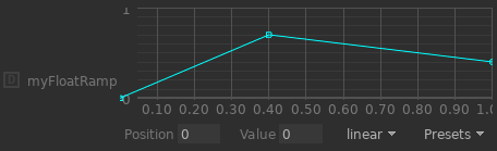
<int name='myFloatRamp' default='5' widget='floatRamp' panZoomEnabled='false'/>
<string name='myFloatRamp_Interpolation' default='linear' options='linear|catmull-rom|bspline' widget='null'/>
<float name='myFloatRamp_Knots' default='0,0,0.4,1,1' size='5' widget='null'/>
<float name='myFloatRamp_Floats' default='0,0,0.7,0.4,0.4' size='5' widget='null'/>
Note
By convention, the positions and values of the first and last knots appear
twice. That means that in order to define 3 knots, 3 + 2 = 5 positions
and 5 values need to be specified, as shown in the example above.
Conditional Visibility and Locking
Conditional Visibility and Conditional Locking allow for parameters and pages to be conditionally visible or locked (against edits) based on value comparisons of referenced other parameters. Hints representing the parse tree of a conditional statement are supported as string hints or string entries within a dictionary hint.
When specifying hints for visibility, the root hint is named
conditionalVisOp. For locking, it’s conditionalLockOp. When using a
<hintdict> element to store the hints, that <hintdict> itself is
named conditionalVisOps and conditionalLockOps respectively. All
examples will be displayed in the <hintdict> form and describe conditional
visibility.
Each conditional is specified with a prefix name suffixed with Op. The
prefix for the root-level condition is always conditionalVis. Operators
which compare values address the referenced parameters via POSIX-style paths
relative to the parameter or page on which the hint is defined. Page names are
included in the parameter path. A conditional expression which evaluates to
false results in the hinted widget being hidden. Comparison values are always
specified as strings and converted to the type of the parameter against which
they’re compared. The available operators and their operands are:
Operator |
Operand 1 |
Operand 2 |
Description |
|---|---|---|---|
|
|
|
Does an equality test with the value specified by |
|
|
|
See above. |
|
|
|
Does an comparison test with the value specified by |
|
|
|
See above. |
|
|
|
See above. |
|
|
|
See above. |
|
|
|
The values of the |
|
|
|
The values of the |
Here is a simple example in which we’ll hint a subpage to be visible only if the parameter value of its peer is non-zero:
<page name="Lighting">
  <param name="someParameter"/>
  <param name="showAdvancedOptions" widget="checkBox"/>
  <page name="Advanced">
    <hintdict name="conditionalVisOps">
      <string name="conditionalVisOp" value="notEqualTo"/>
      <string name="conditionalVisPath" value="../showAdvancedOptions"/>
      <string name="conditionalVisValue" value="0"/>
    </hintdict>
    <param name="anotherParameter"/>
  </page>
</page>
Another example demonstrating the or operator and the relationship of
prefix in the operand values. This will display the “Advanced” page
if either the showAdvancedOptions parameter is non-zero or the
someParameter value is greater than 1.0:
<page name="Lighting">
  <param name="someParameter"/>
  <param name="showAdvancedOptions" widget="checkBox"/>
  <page name="Advanced">
    <hintdict name="conditionalVisOps">
      <string name="conditionalVisOp" value="or"/>
      <string name="conditionalVisLeft" value="conditionalVis1"/>
      <string name="conditionalVisRight" value="conditionalVis2"/>
      <string name="conditionalVis1Op" value="notEqualTo"/>
      <string name="conditionalVis1Path" value="../showAdvancedOptions"/>
      <string name="conditionalVis1Value" value="0"/>
      <string name="conditionalVis2Op" value="isGreaterThan"/>
      <string name="conditionalVis2Path" value="../someParameter"/>
      <string name="conditionalVis2Value" value="1.0"/>
    </hintdict>
    <param name="anotherParameter"/>
  </page>
</page>
Please note that only the root operation is required to have a prefix
starting with conditionalVis. The prefixes of the second and third
operations are defined here by the values of conditionalVisLeft and
conditionalVisRight - and could be anything.