Search is based on keyword.
Ex: "Procedures"
Do not search with natural language
Ex: "How do I write a new procedure?"
Properties Panel
The Properties panels are the chameleons of the viewport family, as they are basically empty frames until an item or tool is selected. Once selected, all the editable attributes related to that item are listed in the panel, where you can make changes to the options available and, if applicable, see them update in the viewport or render previews.
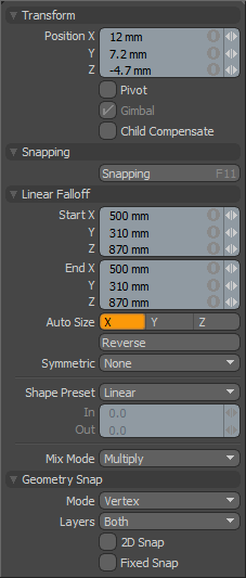
The main Properties panels are those of the toolbox and item properties. In the default Model interface, the toolbox Properties panel appears on the left side of the interface under the toolbox itself. Upon loading, the panel is empty, but as tools are selected, the attributes appear in it. Additionally, when falloffs, action centers, and snapping modes are enabled, additional sections of the Properties panel begin to fill, presenting all the editable settings related to the active tools and functions.
Courtesy William Vaughan
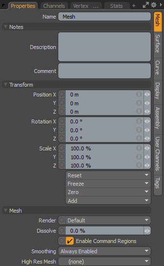
This is the same case with the item properties, located on the right side of the default interface. Unlike the tool properties, it is a tab, so you may need to select the particular Properties tab to make it visible. Upon loading Modo, the panel appears empty, but selecting items populates the panel with the various attributes related to the selected items. Unlike the tool properties, where the various additional attributes stack up, the item properties adds additional sub-tabs down the right edge of the panel that relates to all selected/active item layers. You can select from the available sub-tabs by simply clicking on them.
|
|
|
|
Toolbox Properties |
Item Properties |
Form View Options
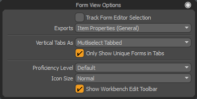
Pressing the O key in the Properties panel opens the Form View Options, where you can customize the appearance and content of the form.

|
Track Form Editor Selection |
When enabled, the form view displays what is currently selected in the Form Editor. |
|
Exports |
When a form's Exported option is enabled in the Form Editor, the form can be selected in a form view. This is also indicated by the X column in the tree. This dropdown lists the forms with Exported enabled. Selecting one displays it in the form view. |
|
Vertical Tabs As |
Select how vertical tabs are displayed. The following options are available: • Tabbed - Tabs are on the right, with one tab selectable at a time. • Multiselect Tabbed - Tabs are on the right, and you can select multiple tabs at the same time by Ctrl+clicking them. • Merged Tabbed - All tabs are merged into a single scrolling form. The tabs remain visible on the right and can be used to jump to different parts of the form. Tabs that are visible are drawn as selected, and change as you scroll the form. • Merged - All tabs are merged into a single scrolling from and the tab bar is hidden. |
|
Only Show Unique Forms in Tabs |
When enabled (the default), this hides subsequent references to the same sub-form when in a Merged or Multiselect mode. This helps to avoid redundant controls, such as the Name field at the top of many Item Properties forms. |
|
Proficiency Level |
This option is used to change the level of detail displayed in the form. • Default - Uses the Base Form Proficiency Level preference in the form. For more information, see Defaults Preferences. • Basic - A short list of the common core properties. • Standard - A list of all of the core properties. • Advanced - A list of all of the core properties plus custom functions for special behaviors. |
|
Icon Size |
Override's the form's default icon size with a custom size. Normal uses the icon size set in the form itself in the Form Editor. The following other options are available: • Extra small Icons • Small Icons • Large Icons |
|
Show Workbench Edit Toolbar |
Enabled by default, when there are any Workbenches in the form, this shows/hides their Edit toolbar. |
Item Notes
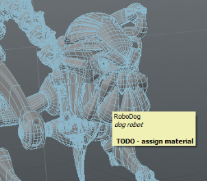
All items' Properties tabs contain a Notes section where you can add notes and comments about the item. The text you enter here is displayed as a tooltip when you hover the cursor over the item in the 3D viewport or the Items list.

The notes section is collapsed by default. Click the small arrow in front of its name to expand it. Fill in the Description and/or Comment field. The item's tooltip is populated with the new information.
You can also filter your items based on having notes, and search the notes in the Item List. For more information, see Adding, Filtering, and Searching Notes.
Tip: You can use Modo's markup feature to add formatting to your notes, such as bolding, italics, bullets, and so on. For more information, see Modo Markup.
Sorry you didn't find this helpful
Why wasn't this helpful? (check all that apply)
Thanks for your feedback.
If you can't find what you're looking for or you have a workflow question, please try Foundry Support.
If you have any thoughts on how we can improve our learning content, please email the Documentation team using the button below.
Thanks for taking time to give us feedback.

