 Search Tips
Render Display
The Render Display window provides a variety of useful options and feedback for working with the resulting rendered pixels for any Modo scene.
Accessing Render Display
There a number of ways to access the Render Display viewport.
• On the main menu bar, click Render > Render to open the Image Display and render pixels.
• On the main menu, click Render > Open Render Window to open the Image Display without rendering any pixels.
• With items selected in the Items List, invoke any of the Render Commands.
• With the Render layout open, click the start arrow in the Image Display area.
• With any layout open, under the layout menu, click Render.
Once open, the window provides a view of the rendered scene, along with a number of useful statistics, comparing tools and image adjustment controls for fine tuning an image. The window is broken into four main areas that are all inter-related: Image Display, Control Panel, Render Browser, and the Network View (minimized by default).
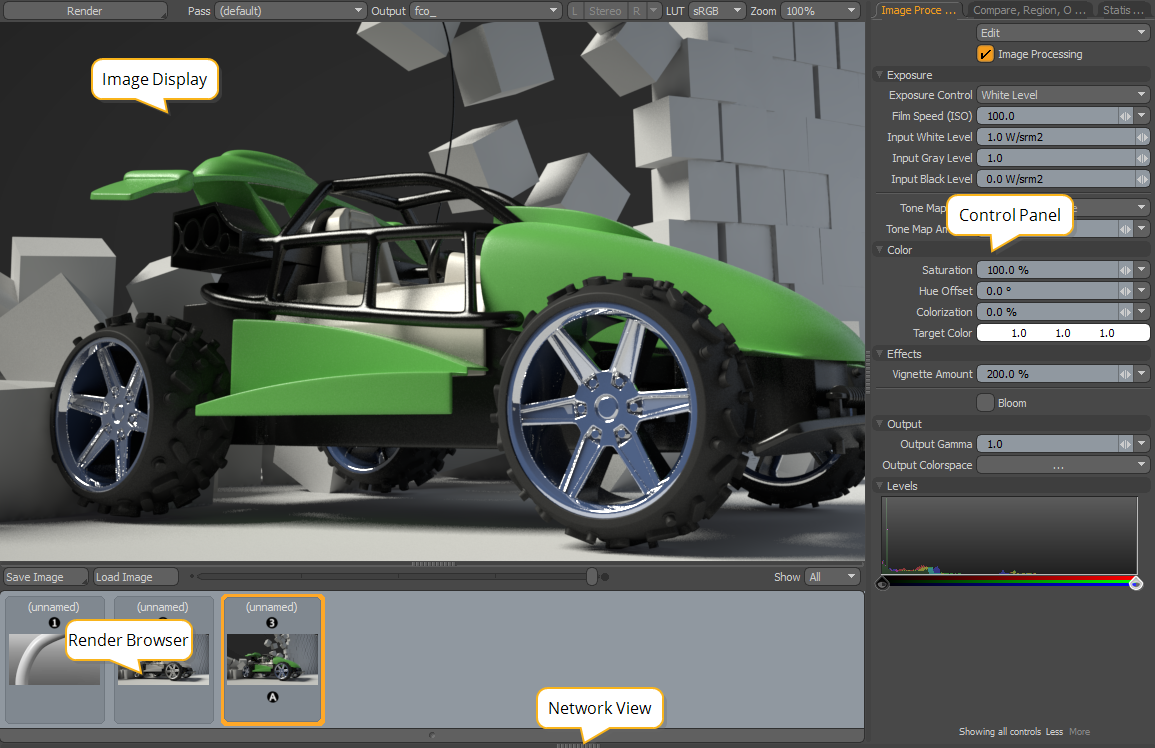
Image Display
This is the main area of the Render Display. This is both a final image display and a source of useful visual feedback to the progression of the rendering frame. Directly above this window are the controls that determine what is actually displayed:
• Render Type - Sets what is rendered in the Render Display, such as Render All, Render Passes, and Bake Texture. Click and hold the Render Type button to display the available options.
• Render Pass - Sets which pass or passes are rendered from the specified Render Type.
• Render Output - Sets the output type rendered from the selected Render Type, such as Full Color Output (fco_).
• Stereo Options - Sets which individual view to display from stereo renders, or how to display both views simultaneously, such as anaglyph or side-by-side.
• LUT - The LUT currently selected for display purposes on your monitor (not to be confused with the output colorspace).
• Zoom - Controls the size of the rendered frame. You can also zoom in the window using Ctrl/Cmd+Alt+click and drag. Once zoomed in, click and drag to navigate across the image. Pressing Ctrl/Cmd+A fits the entire image to the viewable area.
Control Panel
The Control Panel is organized into three tabs, each with a dedicated function:
• Image Processing - Provides non-destructive controls to adjust, correct, and tone the rendered image.
• Compare, Region Options - Provides tools for rendering limited regions and comparing subsequent and prior renders.
• Statistics - Provides dynamic information regarding the frame during rendering, such as memory usage, elapsed time, and the final numbers of polygons.
Note: The Levels histogram is hidden by default. Click the Showing Standard Controls More button at the bottom of the panel to display Levels.
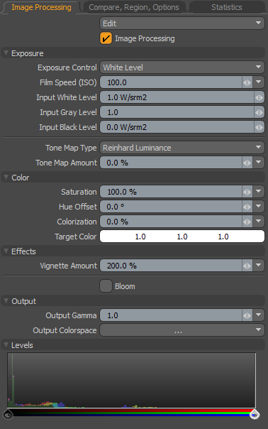
Image Processing
The Image Processing section provides controls to adjust the look of the final rendered image. It can replace an external image editor, but best of all, it's non-destructive. Adjusting the values in the panel updates the Image Display, providing real-time feedback to the changes, making it easy to experiment and try different combinations.
|
Option |
Description |
|---|---|
|
Edit |
Provides options for moving image processing settings between the render output and the Render Display window. • Copy From Scene - If adjustments were made to the render output options after the rendered image completes, the Copy from Scene option grabs those settings, updating the options of the Render Display window to match. • Paste to Scene - Any adjustments made to the rendered image within the Render Display window do not apply to subsequent renders, as the Render Display window reverts to the settings of the Render Item. The Paste to Scene option copies the settings to the render output back to the scene, applying it to all subsequent renders. • Reset - Returns all image adjustment options to their default values. |
|
Image Processing |
Toggles the effect of the Image Processing controls on and off, allowing you to quickly switch between the previous image and adjusted image. |
|
Exposure |
|
|
Exposure Control |
Sets the exposure preset to apply to the image: • White Level - Defines the amount of luminance (illumination brightness) that corresponds to pure white in the rendered image, adjusted with the Input White Level value. • Photographic - Produces similar results to White Level, but uses the Film Speed (ISO) setting more familiar to photographers. |
|
Film Speed (ISO) |
Sets the sensitivity of the film or sensor when Exposure Control is set to Photographic. Higher values simulate increased exposure time, but without any added noise. |
|
Input White Level |
Specifies the radiance or luminance level that corresponds to pure white in the final rendered image (a pixel color value of 1.0), when Exposure Control is set to White Level. Higher values tend to darken the image, requiring a much brighter area to represent the whitest white, but can also be used to bring out detail in overblown areas. Note: To use the input level controls effectively, Clamp Colors must be disabled in the Shader Tree > Render Output sub-tab. |
|
Input Gray Level |
A non-linear luminance adjustment that applies a curve-like function to the pixels, modifying the mid-range the most while attenuating the adjustment amount for values moving toward the defined Black and White points. Values above 1.0 lighten the mid-range, while values below 1.0 darken the mid-range. |
|
Input Black Level |
Specifies the radiance or luminance level that corresponds to pure black in the final rendered image (a pixel color value of 0.0). Note: To use the input level controls effectively, Clamp Colors must be disabled in the Shader Tree > Render Output sub-tab. |
|
Tone Map Type |
Sets the mapping type used to control tonal balance. Select the required type and then use the Tone Map Amount to control the range. |
|
Tone Map Amount |
Controls the overall tonal balance of the rendered image, compressing the rendered dynamic range into something viewable, where shadows and highlights can reveal previously obscured details. Often, it takes a combination of settings for white level, tone mapping, and gamma to achieve the best results. For further examples, see Tone Mapping. Dynamic range is measured as the difference between the darkest shadow to the brightest highlight in an image. Most image formats' dynamic range pale in comparison to that of the world around us. In the same way that a photographer struggles to capture all of the range our eyes can see, you may find your renders have shadow areas that are too dark, and highlight areas that are too bright. Luckily, Modo renders in full floating point accuracy, providing dynamic range well beyond what any monitor is capable of displaying. Note: To use the input level controls effectively, Clamp Colors must be disabled in the Shader Tree > Render Output sub-tab. |
|
Color |
|
|
Saturation |
Controls the concentration or amount of color in an image independent of the luminosity of brightness. At 100%, colors are fully saturated as defined in the item's material settings. Reducing the value reduces the overall color saturation to a value of 0%, producing an image only with gray shades. Tip: Modo renders in full 32-bit floating point accuracy, so values above 100% increase saturation without introducing the color banding and artifacts generally associated with over-saturating images. |
|
Hue Offset |
Adjusts the color values of the rendered image independently of the luminosity or brightness values, shifting them across the entire spectrum in a sequential fashion. Hue values are arranged on a standard colorwheel, where a rotation of 180° inverts all the color values. For example, shifting a red color in a positive direction adjusts reds toward an orange hue, then yellow, and so on. |
|
Colorization |
Introduces an overall color tint into an image. This can be purely for artistic reasons, but can also be helpful in reversing color casts introduced by image-based lighting among other things. Define a tint color using the Target Color control and then adjust the Colorization amount to determine the strength of the color in the image. A value of 0% produces no colorization, attenuating toward 100% where the image is replaced fully by the Target Color. |
|
Target Color |
Specifies the tint color when the Colorization control is set above 0%. |
|
Effects |
|
|
Vignette Amount |
Setting Vignette Amount to 100% creates a physically accurate vignette simulation, a natural reduction of the brightness of an image toward the outer edges of the frame, based on the camera's focal length and film size. Values above 100% darken the resulting vignette, and values below 100% reduce its visibility. |
|
Bloom |
When enabled, two additional options display, Threshold and Radius. Adjusting these controls provides near real-time feedback in the Render Display window. In photography, when a very bright part of an image neighbors a very dark part, the bright part appears to glow. This phenomenon is known as Bloom. Modo's Bloom simulates this effect by removing excess energy from a pixel and distributes it around to its neighbors. |
|
Bloom Threshold |
Sets the lower threshold to which pixels are effected, when Bloom is enabled. When set to 100%, only the hottest specular highlights bloom, whereas at 0%, every pixel in the scene receives the effect. For examples, see Basic Render Outputs. Note: This control is only available when Bloom in enabled. |
|
Bloom Radius |
Sets the distance that energy is distributed, in effect controlling the size of the glow. Higher values can impart an ethereal look to the rendered image. For examples, see Basic Render Outputs. Note: This control is only available when Bloom in enabled. |
|
Output |
|
|
Output Gamma |
Controls the amount of gamma applied to the rendered image, for both display and when the image is saved. It can be used as an image adjustment control to lighten or darken the image without the need to externally adjust it in an external bitmap editor. The gamma adjustment is non-linear and affects the mid-tones of the image more than the shadows and highlights. For best results, leave the gamma value at the default 1.0. |
|
Output Colorspace |
Defines the colorspace of the rendered frame. When set to default, the colorspace definition is derived from the Scene Item settings. Changing the value here results in an override that can be set per output. The default settings generally produce the correct results, but you can experiment as required due to the non-destructive nature of the Render Display. For more information on color management, see Color Management. |
|
Levels |
|
|
Levels |
Slides all color values up or down the value scale, shifting them identical amounts in the rendered image. For example, if an image has a 0% black pixel and a 50% gray pixel, offsetting the values 50% results in the black pixel changing to 50% gray and the gray pixel changing to 100% white with all other values changing with the corresponding amounts. Note: The Levels histogram is hidden by default. Click the Showing Standard Controls More button at the bottom of the panel to display Levels. |
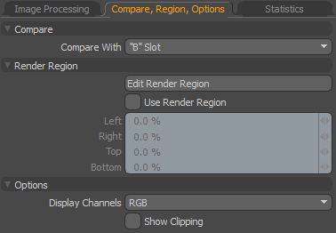
Compare, Region, Options
|
Option |
Description |
|---|---|
|
Compare - These options allow you to examine two images in a variety of ways, making it easier to contrast any differences between them. |
|
|
Compare with |
Determines which opposing images are compared: • None - No image comparison • "B" Slot - Two separate images are compared. Slot A is determined by the current image selected in the browser and Slot B is determined by holding the Ctrl/Cmd key and clicking on a second image slot in the browser. A small A and B icon appears beneath each image, signifying which is which. • "A" Slot Output - Compares passes or outputs associated with a single image, selected using the Pass and Output controls. |
|
Pass |
When the "A" Slot Output option is selected, determines which Pass to compare against the default pass. |
|
Output |
When the "A" Slot Output option is selected, determine which Output to compare against the default output. |
|
Apply Image Processing |
Toggles the effect of the Image Processing controls on and off, allowing you to quickly switch between the original image and adjusted image. |
|
Compare Mode |
Several modes define how the two images are compared, each with additional options. • Wipe - The images are overlaid and the top image is wiped away, revealing the lower image. Use the Wipe Method, Position, and Opacity Controls to set the wipe behavior. • Spotlight - Reveals the B images as a circle around the pointer (move over the image to see the results). The size of the circle is determined by the Spotlight Radius control. • Side by Side - Displays two half-width images next to each other. |
|
Wipe Method |
When Compare Mode is set to Wipe, allows you to select Horizontal, Vertical, or Dissolve wiping. |
|
Position |
When Wipe Method is set to Horizontal or Vertical, sets the position of the wipe widget in the viewport. |
|
Opacity |
When Wipe Method is set to Dissolve, sets opacity of the top image to reveal the image underneath. |
|
Spotlight Radius |
When Compare Mode is set to Spotlight, allows you to control the radius of the spotlight. |
|
Stack Vertically |
When Compare Mode is set to Side by Side, enable this control to stack the images vertically instead of horizontally. |
|
Difference |
Calculates the pixel variance between the two images and displays it as a grayscale image. Black indicates no difference between the two pixels, attenuating toward white, which indicates the maximum difference. The amount of difference displayed can be scaled using the Difference Scale. Each of the available options displays the difference between the two images for the chosen aspect, such as the difference between the Hue of both images, or the difference of the Saturation amount. Utilizing the Difference option can be especially helpful in pinpointing subtle differences between two similar images. Note: This is mostly for high dynamic range images (HDR), but in some cases it provides a better indication of dramatic or subtle differences. The difference calculation is the same math used to determine the difference between two numbers (subtracting one value from the other). |
|
Difference Scale |
Scales the amount of difference for the selected Difference option. Note: This control is only available when Difference is set to something other than none. |
|
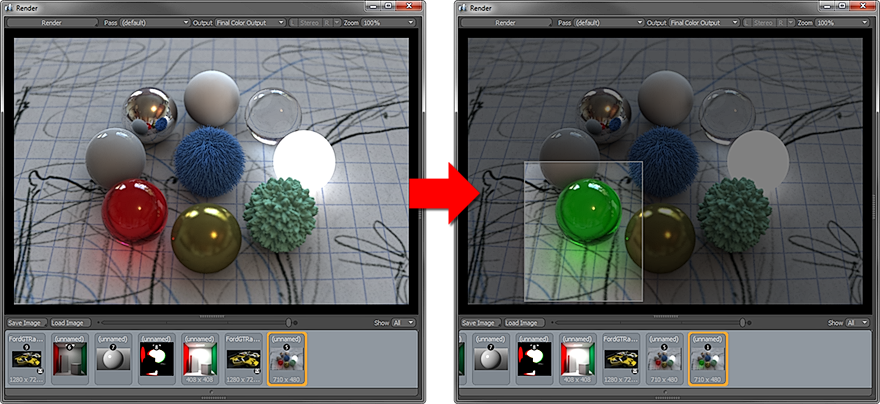
Render Region - Allows you to selectively render a smaller segment of the entire image, making the iterative process of creating a final rendered image faster and more fluid. For convenience, these settings duplicate the functionality of the render item's Render Region functionality. For more details on the Render Region, see Render Item: Frame |
|
|
Edit Render Region |
When enabled, you can drag directly over the rendered image to define the limited region area interactively. When the initial area is defined, edges and corners of the region are highlighted, allowing you to further refine the region. Click and drag the highlighted border to adjust. If edits are made to the same scene, the area outside the defined region is used as a background to successive renders until disabled. When switching between scenes or image resolutions, the background area outside the region renders black. |
|
Use Render Region |
Temporarily enables and disables the Edited Render Region without losing any of the settings. |
|
Left/Right/Top/Bottom |
Allows you to specify the total rendered region width and height manually. |
|
Options |
|
|
Display Channels |
All resulting rendered images are generated as standard RGB bitmap format images. For diagnostic purposes, it may be useful to see the individual Red, Green or Blue color channels of an image. |
|
Show Clipping |
When enabled, a diagonal black and white stripe pattern (called a zebra pattern) displays over overexposed or blown out areas of the image, providing useful feedback for adjusting image white point and tone mapping an image to compress as much dynamic range information as possible. |
Statistics
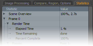
The Statistics panel provides a huge amount of statistical information related to rendering the scene. Included in this information is the elapsed time, as well as an approximate remaining time for in-progress frames. For finished frames, the total rendering calculation time is displayed, along with total memory usage, and total number of polygons generated.
Navigation of the list works the same as other viewports. You can open or close a specific section by clicking the preceding arrow ( ). To open or close all sub-sections of a specific topic, press Shift and click preceding arrow () to view all the information related to a single frame.
Render Browser
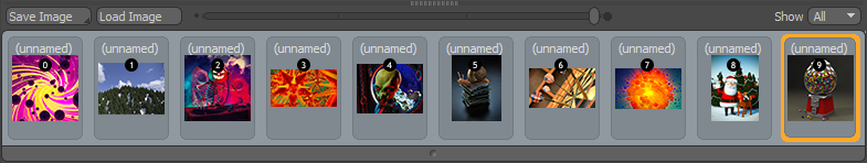
The Render Browser allows for an unlimited number of rendered frames. The default is set to show the past 10 rendered frames, but you can change this in the Options panel. The browser itself serves a couple of purposes, the most important being that you can select the current image to display in the display area by clicking on any of the icons. The thumbnail of the selected image is highlighted in orange; only the selected image can be modified using the image adjustment controls. The render order of images is also displayed using the small number icons above each image. You can use the keyboard numeric keys to select a specific render slot as well as easily swap between different renders, simply by pressing its corresponding numeric key.
When you hover over an icon, two additional controls appear: an X that removes the image from the browser (deleting it from disk) and a small lock icon you can click to stop items being deleted accidentally. Click the lock icon again to unlock. You can select multiple images by holding the Ctrl/Cmd key, allowing you to remove, lock, or unlock multiple images at once.
The Render Browser is also used to load and save images. Images in the Render Browser are held in the render buffer until you save them, but you can still view and modify them in the Render Display. Using the Save Image button directly above the browser allows you to define a format and location for the image. For more information concerning images and formats, see Saving Images.
You can also load images into the browser area, which is very helpful when you want to apply image adjustments, or use previous renders to compare a current render, such as when the render buffer no longer exists. To load an image:
| 1. | Click the Load Image button above the browser area. |
An OS-specific browser displays.
| 2. | Navigate to the stored image location and select the target file. |
| 3. | Click Open to load the file into the browser. |
Note: If any modifications are applied to the file, it must be saved again to retain the changes.
Network View
Below the Render Browser area is a minimized Network View panel. Open the panel by clicking on the small group of tiny squares and dragging it upward. This browser indicates the number of cores available on each machine, machine name, user name, mode, status and message. You can also tell if a machine is connected to your active host by the color of the text:
• Green - Indicates that the machine is connected and ready for rendering.
• Black - Indicates systems that are connected, but not enabled as slaves.
Any other color indicates a problem with the connection or availability.
General View Shortcuts
The Render Display provides standard Modo controls to adjust size and minimize frames, all the while automatically adjusting the interface, giving you control over what can be seen. Dragging the splitters between the panels scales the contents of each. There are also some additional controls that provide an easy way to quickly make certain panels within the display visible.
• Spacebar - Minimizes everything except the image pane.
• T - Toggles thumbnail panel visibility.
• N - Toggles the network view.
• I/C/S - Toggles the right-hand panel tabs (Image Processing/Compare/Statistics respectively).
Render Region
The 3D process is one of constant iteration and refinement. Rendering entire images repeatedly is a significant waste of time and a disruption to the creative workflow. To alleviate some of this pain, Modo provides the Render Region rendering functionality. You can use the Left/Right/Top/Bottom functions to specify the region manually, or use the Render Region tool to specify an area by dragging in any 3D viewport.
You can find the tool in the left panel of the Render layout, in the Render Region toolbar. Using the toolbar, you can activate and set a render region in preview, and change the camera being used to render it.
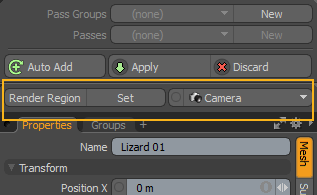
To use the tool:
| 1. | Click Render Region to activate the tool. |
| 2. | To set a region, click Set, then click and drag in the 3D viewport to specify area. |
When a render command is invoked (such as by pressing F9), only the area within the region specified is rendered.
To change the render camera, click Camera, and select the camera you need from the dropdown.
Additionally, the function can be activated through a button of the Render Display window, under the Options tab.