When you insert a node, its properties panel automatically appears in the Properties pane with options to define the node’s output. You can also open the properties panel later by doing any of the following:
• Double-click on the node in the Node Graph.
• Ctrl/Cmd+click on the node in the Node Graph.
• Select the node in the Node Graph and press Return.
TIP: To open a properties panel in a floating window, Ctrl/Cmd+Alt+click on the node.
You can limit the number of open properties panels that can be open in the Properties pane. To do so, enter the maximum number of properties panels in the field on the Properties pane.
To lock the Properties pane and have all new properties panels appear in floating windows, click the lock button on the Properties pane.
To empty the Properties pane and close all the properties panels in it, click the remove all panels button.
TIP: You can also close all the properties panels in the Properties pane by Alt+clicking on the close (X) button of one of the panels.
These are the standard controls of every properties panel:
Control |
Function |
|
Hide or show the node’s tabbed pages. |
|
Centers the node in the Node Graph. |
|
Centers one of the node’s inputs in the Node Graph. Select the input from the dropdown menu that appears. |
|
You can save, load, and manage node presets here. |
name field (for example, Blur1) |
You can enter a new name for the node here. |
(left) |
Changes the color of the node. You can drag and drop this button on top of another color button to copy the color. To revert to the default color defined in your Preferences, right-click on the button and select Set color to default. An X on the button indicates the color is unset, and the color defined in the Preferences is used. |
(right) |
Changes the color used for the node’s controls in the Viewer. You can drag and drop this button on top of another color button to copy the color. To revert to the default color defined in your Preferences, right-click on the button and select Set color to default. An X on the button indicates the color is unset, and the color defined in the Preferences is used. |
|
Undoes the last change made to the node. |
|
Redoes the last change undone. |
|
Reverts any changes made after the properties panel was opened. |
|
Displays Online Help related to the node and its controls. NOTE: If the Online Help is unavailable, a tooltip displays information about the node. |
|
Floats the properties panel. Clicking this button again docks the properties panel back in the Properties pane if the pane is open. |
|
Closes the properties panel. Alt+click this to close all the properties panels in the Properties pane. Ctrl/Cmd+click to close all properties panels except the one clicked on. |
Floating control panels also include the following buttons:
Control |
Function |
|
Reverts any changes made after the properties panel was opened. |
|
Reverts any changes made after the properties panel was opened and closes the properties panel. Hitting this button right after a node was created also deletes the node from the Node Graph. |
|
Closes the properties panel. |
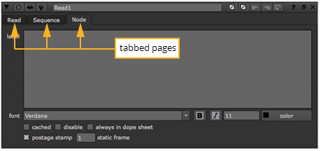
Many properties panels also contain several tabbed pages.
The Read node’s properties panel and the Node tab. |
On the Node tab, you can usually adjust the following controls:
Control |
Function |
label |
Lets you add comments to the node. The comments are displayed on the node’s surface. If you like, you can use HTML in the label field. For example, to have your comments appear in bold, you can enter <b>My Comment</b>. To add an icon called MyIcon.png to the node, you can use <img src="MyIcon.png"/>. Save the icon in your plug-in path directory Note that the HTML has been changed to a slightly non-standard form where newlines are significant. If there is a newline character in your data, a new line is displayed in the label. |
font |
Lets you change the font for any text displayed on the node. |
|
Bolds any text displayed on the node. |
|
Emphasizes any text displayed on the node. |
Lets you change the font size of any text displayed on the node. | |
|
Lets you change the color of any text displayed on the node. |
hide input |
Check this to hide the node’s incoming pipe. This control does not appear on all nodes. |
cached |
Check this to keep the data upstream from the node in memory, so that it can be read quickly. When this is checked, a yellow line displays under the node in the Node Graph. |
disable |
Check this to disable the node. Uncheck to re-enable. (You can also disable or re-enable a node by selecting it in the Node Graph and pressing D.) |
dope sheet |
Check this to force the node to always display in the Dope Sheet. You can also press Alt+D to toggle this on and off. By default, the Dope Sheet displays all your Read nodes that have their control panels open, and any nodes you’ve used to create keyframes. |
bookmark |
Check this to show the node in the bookmark list. This allows you to quickly navigate to the node. For more information, see Navigating Inside the Node Graph. |
postage stamp |
Check this to display a thumbnail render of the node’s output on its surface. You can also press Alt+P on the Properties Bin to toggle postage stamps. |
static frame |
If you want the postage stamp to display a fixed frame (rather than update to match the current frame), enter the frame to display here. For this to work, you also need to press Shift+S to open the Preferences dialog, go to the Node Graph tab, and make sure postage stamp mode is set to Static frame. Note that if the frame number you use is outside the frame range for the node, it is clamped to the first or last frame in the range. |
lifeteme range |
Enter a start and end frame to control the frame range when this node is active. You can quickly toggle the lifetime on and off with use lifetime. |
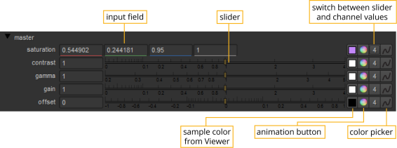
To display a node’s parameters, double-click the node. It’s properties panel appears.
The image below shows the controls available for editing parameters. Note that the presence of each control varies according to the parameter’s function.
You can key values directly into a field, press the arrow keys to increment and decrement values, or use the middle-mouse button to activate virtual sliders.
To key in field values:
1. | Double-click in the field to select the whole value. |
2. | Type the value you want to replace the selection. |
TIP: You can also enter expressions (programmatic instructions for generating values) into fields. You always start an expression by typing =. See Expressions for information about how to format expressions.
TIP: Nuke also allows you to enter formulas into fields, making it easy to do quick calculations. For example, if you wanted to halve a value of 378, you could simply type 378/2 into a field and press Enter to get 189.
You can increment or decrement field values by hundreds, tens, tenths, hundredths, and so on. The magnitude of change depends on the initial position of your cursor. For example if you wanted to increment the initial value of 20.51 by ones, you would insert your cursor before the 0.
To increment or decrement a field value:
1. | Click to insert the cursor just prior to the digit you want to increment or decrement. |
2. | Press the up arrow to increment by one unit, or the down arrow to decrement by one unit. |
TIP: You can also increment and decrement values using the mouse wheel (if available) or by pressing Alt while dragging on the value. The latter method is particularly useful for tablet users.
To use a virtual slider, you can hover the cursor over a numeric control, click the middle-mouse button, and drag the field to adjust the associated control.
TIP: Hold Shift to increase slider sensitivity.
|