Locators are like the Swiss army knife of 3D; playing a key role in animation, it serves many important functions: targets, controllers, parents, manipulators, selectors, and even joints. Since locators are just items, they have their own set of properties, the most important being their own transforms, and as such, they can be positioned and animated independently of Mesh Items in a scene. This might not seem so exciting by itself, as locators don't even render, but when working with constraints, modifiers, and influences, you quickly discover how useful they really are, serving as the virtual backbone of any rigging setup. As such, there are some special properties associated specifically with locators. Additional draw properties specific to Locators are available in the Display sub-tab. Pick Walking and Selection Redirect settings are available via the Assembly viewport.
You can add a Locator to a scene using the Add Item button, found in the top-right corner of the Item List viewport. Additionally, you can use the menu bar command Item > Create Locator. Once selected, the locator's attributes become available in the Properties viewport.
Name: This data field displays the current item name. You can change it by clicking into the field and typing the new name.
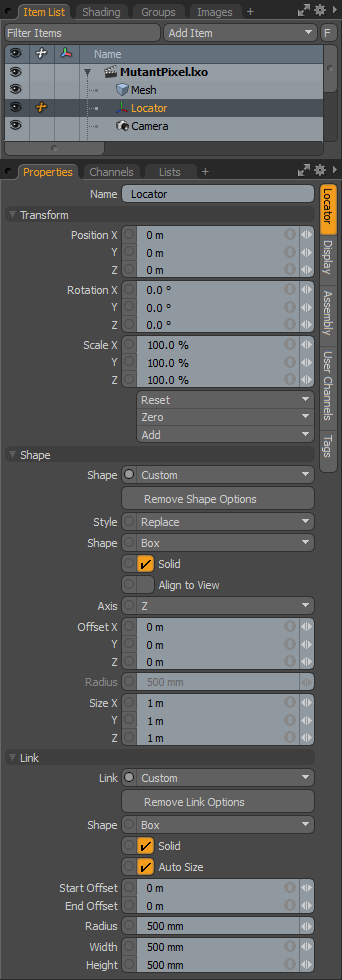
Position: An item transform that allows you to numerically position the item in XYZ space.
Rotation: An item transform that allows you to numerically set the rotation of the item.
Scale: An item transform that allows you to numerically set the size of the item.
Reset: Resets the selected transform values to (0,0,0), returning the items to their default state.
Zero: Resets the chosen transform property values to 0, leaving the center position and mesh position intact. This is done by adding an additional transform item, with an inverted version of the current values, to the Mesh Item's channels. This is useful to allow a joint, for instance, to have a base value of 0,0,0, whilst still being located away from the World Origin.
Add: This option adds additional transform items if such items already exist, or creates new ones, if not. Transform items are the channel groups that store the actual transform values, controlling any item's position, rotation, and/or scale. You can add as many transform items as you wish for each transform property. Adding additional transform items produces an additive effect whereby transform groups are evaluated in succession. Additional item transforms are evaluated in their order in the Channels list, from the bottom upwards.
By default, new items do not have any transform items associated with them (even though they are visible here within the Properties panel). This is useful as an optimization as only the necessary transforms are created on an as-needed basis, reducing scene overhead. There are several actions that add these base transform items. One is by simply transforming the target item with one of the various transform tools or by editing the values input fields. This action causes the particular transform item to be added automatically to the Channels viewport. Because of this, you may need to specifically create item transforms when referencing, because in order to override the channels in the master scene, they must first exist.
Shape: Choose between the Default cross style, or choose Custom to enable additional properties for locator display customization.
Remove Shape Options: This button removes the additional Shape options, reverting to the Default cross representation.
Style: Controls whether the Shape options draw in addition to the default value (Add) or if they replace its display (Replace).
Shape: Choose from multiple primitive shape options for the locator's representation.
Solid: Toggles between a filled or wireframe representation of the shape.
Align to View: Forces the representation to align with the viewport's camera.
Axis: Chooses the axis for display of the shape representation.
Offset: Adjusts the offset values to position the locator representation.
Radius: Adjusts the size of circular locator representations.
Size: Adjusts the size of rectangular locator representations.
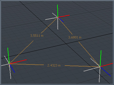
Modo can automatically draw a non-rendering element between an item and its child (links always draw to child items in hierarchies). Links are useful in creating visual representation of an item's associations in complex hierarchies.
Link: Choose between the default value None, or a simple Line, or choose Custom to enable additional properties for link display customization.
Remove Link Options: This button removes the additional Link options reverting to the default None.
Shape: Choose from multiple primitive shape options for the link representation.
Solid: Toggles between a filled or wireframe representation of the shape.
Auto Size: Dynamically scales the link shape depending on the distance between the two items.
Start Offset: Offsets the start position of the link representation.
End Offset: Offsets the end position of the link representation.
Radius: Adjusts the size of circular link representations.
Width/Height: Adjust the size of rectangular link representations.
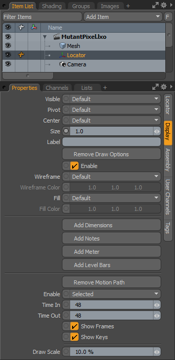
Visible: Sets visibility for the 3D item itself, Default respects viewport settings, Yes sets the item as visible always, No disables visibility entirely.
Pivot: Sets visibility for the 3D item pivot, Default respects viewport settings, Yes sets the pivot as always visible, No disables pivot visibility entirely.
Center: Sets visibility for the 3D item center, Default respects viewport settings, Yes sets the center as always visible, No disables center visibility entirely.
Size: Multiplier that adjusts the display size of the locator.
Label: Typing in text for the Label displays the text positioned next to the locator in the viewport for easy identification. It also adds two additional properties to control the display of the label in the viewport - Show Label and Label Offset.
Show Label: This toggle temporarily enables or disables the display of the label in the viewport without losing settings.
Label Offset: This value specifies the distance away from the locator where the label appears.
Add/Remove Draw Options: The Draw Options control the look of the locator in 3D Viewports, used mostly when Custom Locator Shapes are enabled.
Enable: This checkbox toggles the display of the Draw Options without losing values.
Wireframe: Adjusts draw color of locator in the 3D Viewport.
Wireframe Color: When Wireframe is set to Custom, the Wireframe Color sets the color of the wireframe part of the locator.
Fill: If Custom Draw shape is set to Solid, this value controls the color of the fill itself.
Fill Color: When Fill Color is set to Custom, this value specifies the RGB color of the fill of the Solid in the 3D Viewport.
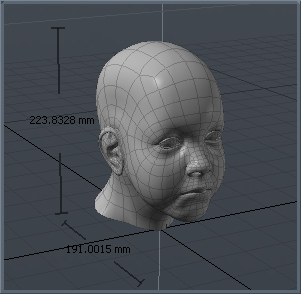
Add/Remove Dimensions: When this option is enabled, dimension values for the overall bounding box size appears in the viewport around the Mesh Item. An additional sub-tab shows in the Properties viewport, allowing further display customizations.
Add/Remove Notes: When this option is enabled, you can define multiple lines of text (up to 9) that show up when the item is selected. An additional sub-tab shows in the Properties viewport, allowing further display customizations.
Add/Remove Meter: When this option is enabled, you can display an on-screen analog style meter graph (looks like a speedometer) that can be rigged to show individual values in the 3D Viewport. An additional sub-tab shows in the Properties viewport, allowing further display customizations.
Add/Remove Level Bars: When this option is enabled, you can display an on-screen equalizer-type graph for visualizing multiple on-screen values. An additional sub-tab shows in the Properties viewport, allowing further display customizations.
NOTE: For more details on display customization, see Additional Draw Options.
Add/Remove Motion Path: To display the motion path for specific items within a scene, you can select the Add Motion Path option, revealing additional properties controlling the display of the path in the 3D GL viewport.
Enable: Provides you a means to toggle the display of the path On or Off, or to have the path only visible when the item is selected.
Time In/Out: Time In determines the number of frames before the current time in the Timeline that are displayed by the curve and Time Out determines the number of frames after the current time that are displayed.
Show Frames: When enabled, displays the position of the element at each frame as a small dot along the path. Can be useful to see how the element moves in time, but can also get busy for some types of motion and can therefore be disabled.
Show Keys: When enabled, displays the position of the element at each keyframe as a white dot along the path.
Draw Scale: This option extrudes a ribbon shape outward from the motion path that represents orientation angle of the animated element. The larger the scale value, the wider the ribbon representation in the viewport.
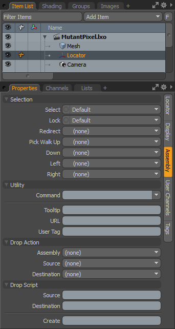
Select: Controls whether or not items are selectable within any 3D Viewport, Yes enables direct item selection, No disables it. Items designated No can still be selected via the Item List.
Lock: When Lock is enabled by selecting Yes, items are locked from the application of any type of item transform.
Redirect: When an item is selected in a 3D Viewport, specifying an item for Redirect triggers Modo to automatically select the alternate item instead. Helpful in easing item selections in complex hierarchies, locators with special Display Viewport properties can be used to visualize selectable items in the viewport that redirect to the actual item you wish to modify.
Pick Walk: The arrow keypad can be used as a way to walk selections through a hierarchy. By default, parent items are selected by pressing the up arrow, and child items are selected by pressing the down arrow. The Pick Walk function allows you to set which items specifically are selected by any of the 4 keys, Up, Down, Left and Right. Say, for instance, you when you reach the bottom of a hierarchy, the foot, you could specify by hitting the left or right arrows the opposing foot would be selected, and by hitting down the head would be selected, an so forth.
Command: The Command option specifies a command to fire when the item is clicked on in the 3D view. This can be any of Modo's commands. There are two commands that are especially useful when setting up assemblies:
• item.channelHaul - This selects any user channels on the item and activates the Channel Haul tool.
• item.channelPopover - This displays a popover form containing controls for any user channels on the item. If used in conjunction with selection direction this can also be used to display the channels belonging to a specific group.
TIP: The Command function is disabled on Mesh Items. To enable the option you can convert a mesh to a static mesh, by right-clicking on the item's layer name in the Items list and select the Change Type > Static Mesh option from the contextual menu. Note that converting a mesh to a static mesh is a destructive action, so make sure you have a backup copy should further editing be necessary to the Mesh Item.
Tooltip: Tooltips are the small blocks of text that appear, if assigned, when the pointer momentarily stays over an item. These can be notes or reminders to what an item is intended to do in a scene but tooltips can also be useful for an assembly author to provide some contextual instructions on how to work with an item in an assembly.
URL: If a custom URL is assigned to an item, Using the F1 help feature and clicking the item in the 3D Viewport opens that particular location. Useful for you to add custom documentation to an item.
User Tag: This is a text string that can be used to identify particular items within an assembly or scene. These tags can be read by scripts with the item.userTag command. An example of use might be to identify items to be deleted or hidden when an assembly script has finished.
Assemblies offer you the ability to create a rig using Modo's many animation modifiers and then save the setup as a Preset for easy application elsewhere. In the following descriptions the item being dragged is referred to as the source item and the item that has received the drop is referred to as the destination item.
Assembly: You can choose from a series of actions that are performed when the preset is initially dropped into the scene from the Preset Browser. The possible actions are as follows:
• Parent - Source item is made a child of the destination item.
• Parent in Place - Source item is parented as above, but with Compensation applied.
• Match - Source item is modified to match position scale and rotation of destination.
• Match Position - Source item is modified to match the position only of the destination item.
• Match Rotation - Dropped item is modified to match the rotation only of the destination item.
• Match Scale - Dropped item is modified to match the scale only of the destination item.
• Insert - Inserts the source item into the hierarchy of the destination item. The item is positioned and orientated to match the destination item and becomes the parent of the destination item.
• Insert at Parent - Similar to Insert but the source item matches its position and orientation to the destination item's parent (if a parent item is present).
• Insert in Place - The source item is inserted into the destination item's hierarchy as its parent but retains its current position and orientation.
• Place - Positions the selected item at the intersection of the mouse pointer and the surface.
• Place and Align - Positions the selected item at the intersection of the mouse pointer and surface rotating the item to match the surfaces normal direction.
Source: The Source drop action is performed when the assembly item is dropped onto a scene item. Same action options as Assembly.
Destination: As above, but the action is performed when a scene item is dropped onto the assembly item. Same action options as Assembly.
Additional to the above actions, scripts can be assigned to run when certain actions occur.
Source: The assigned script (omitting the @) runs when this item is dropped onto another in the scene. The script gets the source item and destination item passed as arguments. If multiple items are dropped then the script is called for each item in turn.
Destination: Same as above, but the script runs when any item in the scene is dropped onto the item it's assigned to. As with the Source Drop Script the source and destination items are passed to the script as arguments.
Add User Channel: User channels are useful in rigging to make simplified controls for complex actions, or to simply give a name to a specific operation. The Add User Channel option allows you to add an unlimited number of user defined Channels to an item. Once a user channel is defined, it is necessary to connect the channel in the Schematic viewport in order to make it operable. Clicking the Add User Channel button opens the Create User Channel dialog where the actual channel is defined. This panel is fully covered in the Add User Channels page of the documentation.
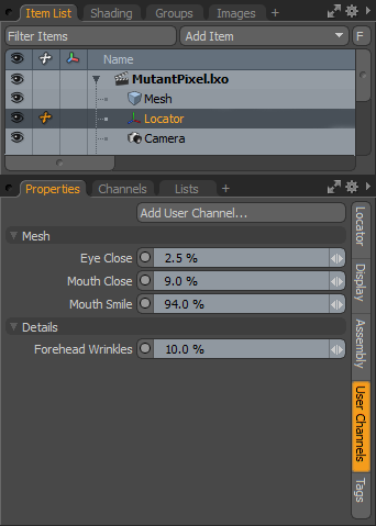
As an example in the panel above, a number of user channels have been added, named by morph maps that are linked to the channels, allowing direct animation access. Other user channels are added that create dividers between the groups. Finally, another channel was also added and linked to an image's opacity channel to control the amount of displacement. All of the defined user channels are then added to a channel group so they can remain on the screen for ease of animation.
The Tag panel allows you to define various tags that remain associated to the specific item. These are typically text strings and are useful to add notes to specific elements for other users in a studio, or as reminders as to how something was meant to be used. There are a few pre-defined tags you can choose from or you can create your own specific tag definition.
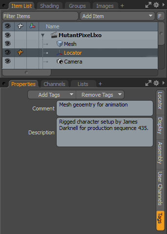
Adding tags is done by pressing the Add Tags button, opening the pop-up menu and then selecting a tag type from the Add Tags menu. There are also options to Add Custom Tags, and Edit Tag definition, opening the appropriate panel in the Modo preferences. For more information, see Preferences.
For all item types there are additional GL drawing properties that allow you to customize the UI for rigging in a number of ways, covered here in more detail. Options are toggled on/off with associated buttons in the Display sub-tab when the target item is selected. The action creates an additional sub-tab that appears alongside the others in the Properties panel.
|
|
|
Show/Hide Dimensions: When this option is enabled, an additional sub-tab appears in the Properties panel titled Dimensions. By default, dimension lines and values for the overall bounding box size appear in the viewport around a Mesh Item, the attributes in the Properties panel allow you to further customize the information that is displayed. Linking a series of items together through a hierarchy allows the display of distances between each object's Center point, from parent to child (the dimension values are only displayed when the parent item is selected).
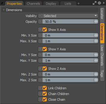
Visibility: Determines the visibility of the dimension lines to Off not visible, On visible and Selected only visible when selected.
Opacity: Controls the transparency of the dimension line and numerical value displays in the 3D Viewport.
Show X/Y/Z Axis: With these channels you can individually control the display for each axis.
Min X/Y/Z Size/Max X/Y/Z Size: The Min and Max values can be assigned for each axis and when the defined values for either Min or Max is reached, the dimension text displays in red in the viewport.
Link Children: When set to true (the default option), Modo draws the link lines to the child items, used to disable if the dimension line linking behavior is undesirable.
Chain Child: When set to true, Modo draws dimension lines from child to child in hierarchical order instead of from parent to each individual child.
Close Chain: When set to true, Modo draws an additional dimension line link back to the parent item from the last child item.
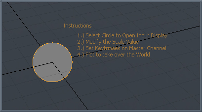
Show/Hide Notes: When this option is enabled an additional sub-tab appears in the Properties panel titled Multi-Line Note. This option allows for on-screen display of custom text strings, for information such as instructions. The text is useful to riggers and TDs, or just to add some helpful reminders for an item when selected.
NOTE: Display text can also be positioned with the Label Offset control.
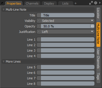
Title: First line of text that displays above the Line entries.
Visibility: Determines the visibility of the Dimension lines to Off not visible, On visible and Selected only visible when selected.
Opacity: Controls the opacity of the dimension line and numerical value displays in the 3D Viewport.
Justification: Determines the justification of the text block to Left, Center, or Right.
Line 1-8: Text line entries that display in the 3D Viewport.
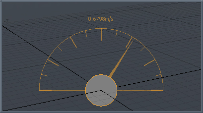
Show/Hide Meter: When this option is enabled, you can display an on-screen analog style gauge graph (looks like a speedometer) that can be rigged to show an individual value in the 3D Viewport. An additional sub-tab appears in the Properties panel titled Dial Meter that allows some customization of the display.
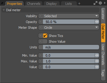
Visibility: Determines the visibility of the Meter display to Off not visible, On visible and Selected only visible when selected.
Opacity: Controls the opacity of the Meter readout and numerical value displays in the 3D Viewport.
Meter Shape: You can choose between a full Circle meter display and a Half Circle display.
Show Tics: Toggles the visibility of 15° and 30° interval lines in the display.
Show Value: Toggles the visibility of the Value information readout above the dial.
Units: A text display that is positioned next to the Value display when the Show Value option is set to true.
Min/Max Value: The Min and Max values determine the lowest value and the highest value displayed in the on-screen meter, controlling the overall position of the Value needle.
Value: This is the input channel that determines the actual value displayed in the viewport, as well as the position of the meter needle (relative to the Min and Max values). Additional rigging is required in the Schematic Viewport in order to connect the Value channel input from an output.
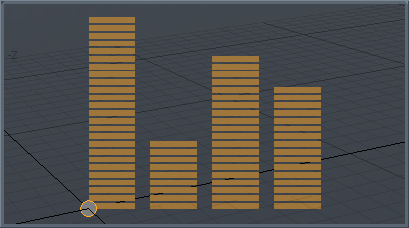
Show/Hide Level Bars: When this option is enabled an additional sub-tab appears in the Properties panel titled Equalizer Bars. This option is used to display an on-screen equalizer-style bar graph for visualizing multiple on-screen values relative to one another. Additional channels show in the Channels Viewport when enabled.
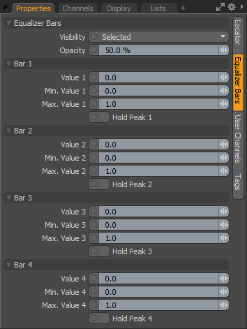
Visibility: Determines the visibility of the Level Bars to Off not visible, On visible and Selected only visible when selected.
Opacity: Controls the opacity of the Level Bars readout display in the 3D Viewport.
Value 1-4: These are the input channels that determine the actual values displayed in the viewport, as well as the scale of the individual level bars (relative to the Min and Max values). Additional rigging is required in the Schematic viewport in order to connect the Value channel input from an output.
Min Value 1-4/Max Value 1-4: The Min and Max values determine the lowest value and the highest value per readout, which is displayed in the on-screen Level Bar, controlling the overall scale of the bar displayed.
Hold Peak 1-4: Like an audio readout, when the Max value is reached for any Value readout, an indicator is drawn in the viewport. Toggle the Hold Peak value to reset the display.
NOTE: Modo can display up to 8 bars by referencing the additional channels available in the Channels viewport.