Many controls in the RotoPaint properties panel apply to both strokes and shapes. These controls are grouped under the RotoPaint tab.
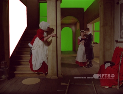
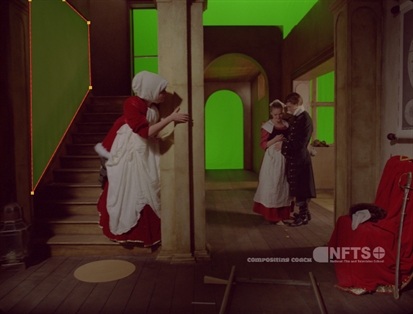
When drawing a stroke/shape, you can set the RGBA color values of the stroke/shape using the color controls on the RotoPaint tab of the RotoPaint properties panel ![]() in the color column.
in the color column.
|
|
|
|
Color set to white (the default). |
Color set to green. |
You can set the opacity of the stroke/shape using the opacity slider. If you set the opacity of a shape to zero, the outline for it won’t be drawn unless the shape is selected. You can also temporarily make the stroke/shape invisible (that is, completely transparent) by toggling the visible box ![]() in the stroke/shape list.
in the stroke/shape list.
|
|
|
|
A low opacity value. |
A high opacity value. |
TIP: When drawing brush strokes, you can tie their transparency to pen pressure. Just check the opacity box next to pressure alters on the Stroke tab of the properties panel.
You can select a source for your stroke/shape and define whether it’s a color, a background, or a foreground image. With your stroke/shape selected, choose a source for your stroke/shape from the source dropdown on the RotoPaint, Shape, or Stroke tabs.
By selecting different blending modes from the blending mode dropdown in the properties panel, you can select how the colors in your strokes/shapes blend with the underlying image. You can also apply blending modes to your strokes, shapes, or groups directly in the stroke/shape list using the blending mode column ![]() .
.
Each of the blending modes blends the primary color, that is the color of the current stroke/shape/group you’re editing with the secondary color, which is the combined color of your background image and any previously rendered strokes/shapes/groups.
The different modes are as follows:
• Color burn - Darkens the primary color to reflect the secondary color by increasing the contrast. No part of the image becomes lighter.
• Color dodge - Brightens the primary color to reflect the secondary color by decreasing the contrast. No part of the image is darkened.
• Difference - Subtracts either the secondary color from the primary color or vice versa, depending on which is brighter. Blending with white inverts the primary color, while blending with black produces no change. Similar colors return black pixels. Difference is a useful mode when working with mattes.
• Exclusion - Creates a result similar to the Difference mode but lower in contrast. Like with Difference, blending with white inverts the primary color. Blending with black produces no change.
• From - Subtracts the primary color from the secondary color.
• Hard Light - Lightens highlights and darkens shadows. If the secondary color is lighter than 50% gray, the result lightens as if it were screened. If the secondary color is darker than 50% gray, the result is darkened as if it were multiplied.
• Max - Selects the lighter of the two colors as the resulting color. Only areas darker than the secondary color are replaced, while areas lighter than the secondary color do not change.
• Min - Selects the darker of the two colors as the resulting color. Any parts that are lighter than the secondary color are substituted. Any parts of the image that are darker than the secondary color don’t change.
• Minus - Subtracts the secondary color from the primary color.
• Multiply - Multiplies the primary color by the secondary color. The result is always darker. Blending with black gives black, and with white returns the color unchanged.
• Over - This mode is the default. The colors of the two images do not interact in any way, and Nuke displays the full value of the colors in the primary image.
• Overlay - Depending on the primary color, multiplies or screens the colors. The secondary color brightens the primary color while preserving highlights and shadows.
• Plus - The sum of the two colors. Increases brightness to lighten the primary color and reflect the secondary color. Plus is similar to the Screen blending mode, but produces a more extreme result.
• Screen - This is a soft Plus making everything brighter but ramping off the whites. Light colors have more of an effect than dark colors. The result is always a lighter color. Blending with black leaves the pixel unchanged, blending with white always returns white. The result is similar to projecting multiple slides on top of each other.
• Soft Light - Depending on the primary color, darkens or lightens the colors. Less extreme than the Hard Light mode.
TIP: Note that changing the stack order of your primary and secondary colors might have an impact on your result. For example, if you have two Bezier shapes overlapping each other with a blending mode active, the result depends on which shape is on top of the other. You can change the stack order of strokes/shapes in the stroke/shape list.