Toolbar Buttons
Toolbar buttons are buttons for use in toolbars.
Class Inheritance
QtWidgets.QWidgetQtWidgets.QAbstractButtonQtWidgets.QPushButton
UI4.Widgets.ToolbarButton
- class UI4.Widgets.ToolbarButton
Bases:
QPushButtonClass implementing a button for use in a toolbar. The button has no label, but uses an icon with optionally different states and modes to indicate whether specific functionality is turned on or off.
Example Screenshot:

- __init__(toolTip, parent, normalPixmap, disabledPixmap=None, rolloverPixmap=None, onPixmap=None, sizeFromPixmap=False, isToggle=False, disabledRolloverPixmap=None, onRolloverPixmap=None, errorPixmap=None, errorRolloverPixmap=None, clickAction=None, blockIconUpdates=False, buttonType='toolbar')
Initializes an instance of the class.
- Parameters:
toolTip (
str) – The tooltip to use for the button.parent (
QtWidgets.QWidgetorNone) – The parent widget to own the new instance. Passed verbatim to the base class initializer.normalPixmap (
QtGui.QPixmap) – The image to use for the button’s icon in its default state.disabledPixmap (
QtGui.QPixmaporNone, default:None) – The image to use for the button’s icon when the button is disabled (/made unavailable).rolloverPixmap (
QtGui.QPixmaporNone, default:None) – The image to use for the button’s icon when the pointer is placed over the button (/hovered).onPixmap (
QtGui.QPixmaporNone, default:None) – The image to use for the button’s icon when the functionality represented by the button is turned on.sizeFromPixmap (
bool, default:False) – Flag that controls whether the button’s size is determined from the given normal pixmap. IfTrue, the button is set to a fixed size that matches the given normal pixmap’s size.isToggle (
bool, default:False) – Flag that controls whether the button is treated as toggling some piece of functionality that can be turned on and off.disabledRolloverPixmap (
QtGui.QPixmaporNone, default:None) – The image to use for the button’s icon when the pointer is placed over the button (/hovered) while the button is disabled (/made unavailable).onRolloverPixmap (
QtGui.QPixmaporNone, default:None) – The image to use for the button’s icon when the pointer is placed over the button (/hovered) while the functionality represented by the button is turned on.errorPixmap (
QtGui.QPixmaporNone, default:None) – The image to use for the button’s icon when the button is meant to indicate an error state.errorRolloverPixmap (
QtGui.QPixmaporNone, default:None) – The image to use for the button’s icon when the pointer is placed over the button (/hovered) while the button indicates an error state.clickAction (
QtGui.QActionorNone, default:None) – An optional action that should be associated with the button. If an action is given, its tooltip is applied to the button, and when the button is clicked, the action is triggered. Furthermore, if the given action is checkable, the button’s on state is determined by the action’s checked state. Note that when an action is given, theisToggleparameter is ignored.blockIconUpdates (
bool, default:False) – Block icon updates if you wish to manage the icons yourself.buttonType (
str, default:'toolbar') – A button type name that controls the button’s appearance through the application’s style sheet.
- disabledPixmap()
- Return type:
QtGui.QPixmaporNone- Returns:
The image used for the button’s icon when the button is disabled (/made unavailable).
- disabledRolloverPixmap()
- Return type:
QtGui.QPixmaporNone- Returns:
The image used for the button’s icon when the pointer is placed over the button (/hovered) while the button is disabled (/made unavailable).
- enterEvent(event)
Event handler for widget enter events.
Reimplemented in order to set a flag to indicate that the pointer has been placed over the button, to update the button’s icon accordingly.
- Parameters:
event (
QtCore.QEvent) – An object containing details about the enter event to process.
- errorPixmap()
- Return type:
QtGui.QPixmaporNone- Returns:
The image used for the button’s icon when the button is meant to indicate an error state.
- errorRolloverPixmap()
- Return type:
QtGui.QPixmaporNone- Returns:
The image used for the button’s icon when the pointer is placed over the button (/hovered) while the button indicates an error state.
- getButtonType()
- Return type:
str- Returns:
A button type name that controls the button’s appearance through the application’s style sheet.
- isEnabled()
- Return type:
bool- Returns:
Trueif the button is available for the user to click, otherwiseFalse.
- isError()
- Return type:
bool- Returns:
Trueif the button indicates an error state, otherwiseFalse.
- isOn()
- Return type:
bool- Returns:
Trueif the functionality represented by the button is turned on, otherwiseFalse.
- leaveEvent(event)
Event handler for widget leave events.
Reimplemented in order to reset a flag to indicate that the pointer is no longer placed over the button, to update the button’s icon accordingly.
- Parameters:
event (
QtCore.QEvent) – An object containing details about the leave event to process.
- mousePressEvent(mouseEvent)
Event handler for mouse press events.
Reimplemented in order to emit the
'rightClicked'signal when the right mouse button has been pressed, and to emit the'mousePressEventSignal'when the left mouse button has been pressed.Accepts and ignores the mouse press event if the button is disabled.
- Parameters:
mouseEvent (
QtGui.QMouseEvent) – An object containing details about the mouse press event to process.
- mousePressEventSignal
- normalPixmap()
- Return type:
QtGui.QPixmap- Returns:
The image used for the button’s icon in its default state.
- onPixmap()
- Return type:
QtGui.QPixmaporNone- Returns:
The image used for the button’s icon when the functionality represented by the button is turned on.
- onRolloverPixmap()
- Return type:
QtGui.QPixmaporNone- Returns:
The image used for the button’s icon when the pointer is placed over the button (/hovered) while the functionality represented by the button is turned on.
- press()
Simulates a click of the button, and changes the button’s appearance to look pressed down.
- release()
Changes the button’s appearance to look normal (not pressed down).
- rightClicked
- rolloverPixmap()
- Return type:
QtGui.QPixmaporNone- Returns:
The image used for the button’s icon when the pointer is placed over the button (/hovered).
- setButtonType(buttonType)
Sets the name of the button type that controls the button’s appearance through the application’s style sheet.
- Parameters:
buttonType (
str) – The name of the button type to use for the button.
- setDisabled(disabled)
Makes the button unavailable or available, depending on the given value, and updates its appearance accordingly.
- Parameters:
disabled (
bool) – Flag that controls whether to make the button unavailableTrueor availableFalse.
- setDisabledPixmap(p)
Sets the image to use for the button’s icon when the button is disabled (/made unavailable), and updates the button so that its icon reflects the given image.
- Parameters:
p (
QtGui.QPixmaporNone) – The image to use for the button’s icon when the button is disabled (/made unavailable).
- setDisabledRolloverPixmap(p)
Sets the image to use for the button’s icon when the pointer is placed over the button (/hovered) while the button is disabled (/made unavailable), and updates the button so that its icon reflects the given image.
- Parameters:
p (
QtGui.QPixmaporNone) – The image to use for the button’s icon when the pointer is placed over the button (/hovered) while the button is disabled (/made unavailable).
- setEnabled(enabled)
Makes the button available or unavailable, depending on the given value, and updates its appearance accordingly.
- Parameters:
enabled (
bool) – Flag that controls whether to make the button availableTrueor unavailableFalse.
- setError(error, toolTip=None)
Updates the button to indicate an error state, or to indicate that the error state has been resolved.
- Parameters:
error (
bool) – Flag that controls whether the button should indicate an error state.toolTip (
strorNone, default:None) – Optional tooltip to use for the button if it indicates and error state.
- setErrorPixmap(p)
Sets the image to use for the button’s icon when the button is meant to indicate an error state, and updates the button so that its icon reflects the given image.
- Parameters:
p (
QtGui.QPixmaporNone) – The image to use for the button’s icon when the button is meant to indicate an error state.
- setErrorRolloverPixmap(p)
Sets the image to use for the button’s icon when the pointer is placed over the button (/hovered) while the button indicates an error state, and updates the button so that its icon reflects the given image.
- Parameters:
p (
QtGui.QPixmaporNone) – The image to use for the button’s icon when the pointer is placed over the button (/hovered) while the button indicates an error state.
- setMenu(self, menu: PySide6.QtWidgets.QMenu) None
- setNormalPixmap(p)
Sets the image to use for the button’s icon in its default state, and updates the button so that its icon reflects the given image.
- Parameters:
p (
QtGui.QPixmap) – The image to use for the button’s icon in its default state.
- setOn(on)
Updates the button’s icon to indicate that the functionality represented by it is turned on or off, depending on the given value.
- Parameters:
on (
bool) – Flag indicating whether the functionality represented by the button is turned on or off.
- setOnPixmap(p)
Sets the image to use for the button’s icon when the functionality represented by the button is turned on, and updates the button so that its icon reflects the given image.
- Parameters:
p (
QtGui.QPixmaporNone) – The image to use for the button’s icon when the functionality represented by the button is turned on.
- setOnRolloverPixmap(p)
Sets the image to use for the button’s icon when the pointer is placed over the button (/hovered) while the functionality represented by the button is turned on, and updates the button so that its icon reflects the given image.
- Parameters:
p (
QtGui.QPixmaporNone) – The image to use for the button’s icon when the pointer is placed over the button (/hovered) while the functionality represented by the button is turned on.
- setRolloverPixmap(p)
Sets the image to use for the button’s icon when the pointer is placed over the button (/hovered), and updates the button so that its icon reflects the given image.
- Parameters:
p (
QtGui.QPixmaporNone) – The image to use for the button’s icon when the pointer is placed over the button (/hovered).
- staticMetaObject = PySide6.QtCore.QMetaObject("ToolbarButton" inherits "QPushButton": Methods: #46 type=Signal, signature=rightClicked(QObject*), parameters=QObject* #47 type=Signal, signature=mousePressEventSignal(QMouseEvent*), parameters=QMouseEvent* )
- toggle()
Turns the functionality represented by this button on or off, depending on its current state.
Emits the
'toggled'signal with the new on/off state of the button.
- triggerAction()
Triggers the optional click action associated with the button.
- See:
clickActionin__init__()
- update()
Updates the button’s icon depending on its state and on the availability of the various images that indicate the button’s state.
Takes into account whether the pointer is placed over the button.
The precedence in which images are used is: enabled/disabled trumps error/no error trumps on/off.
UI4.Widgets.AutoKeyAllToggle
- class UI4.Widgets.AutoKeyAllToggle
Bases:
ToolbarButtonClass implementing a toolbar button to toggle the global auto keyframe state.
Registers an event handler for the
"parameter_setAutoKeyAll"event, to update the button when the state changes.Uses a slot to update the state when the button is clicked.
Uses
NodegraphAPI.GetAutoKeyAll()to determine the state, andNodegraphAPI.SetAutoKeyAll()to set the state.Example Screenshot:

- __init__(parent=None)
Initializes an instance of the class.
- Parameters:
parent (
QtWidgets.QWidgetorNone, default:None) – The parent widget to own the new instance. Passed verbatim to the base class initializer.
- staticMetaObject = PySide6.QtCore.QMetaObject("AutoKeyAllToggle" inherits "ToolbarButton": )
UI4.Widgets.CatalogLockWidget
- class UI4.Widgets.CatalogLockWidget
Bases:
ToolbarButtonClass implementing a toolbar button to lock or unlock a specific catalog item against or for replacement and deletion.
Code example:
catalogLockWidget = UI4.Widgets.CatalogLockWidget()
catalogLockWidget.setCatalogItem(
    CatalogManager.CatalogItem.CreateCatalogItemFromID('i_1_0'))
catalogLockWidget.show()
Example Screenshot:

- __init__(parent=None)
Initializes an instance of the class.
- Parameters:
parent (
QtWidgets.QWidgetorNone, default:None) – The parent widget to own the new instance. Passed verbatim to the base class initializer.
- setCatalogItem(catalogItem)
Sets or resets the catalog item whose locked state to represent by this button.
- Parameters:
catalogItem (
CatalogAPI.CatalogItem.CatalogItemorNone) – The catalog item whose locked state to represent by this button, orNoneto reset the catalog item.
- staticMetaObject = PySide6.QtCore.QMetaObject("CatalogLockWidget" inherits "ToolbarButton": )
- updateState()
Updates the visibility of this button and its on/off state depending on whether a valid catalog item is associated with this button, and on whether that item is locked.
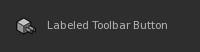
UI4.Widgets.LabeledToolbarButton
- class UI4.Widgets.LabeledToolbarButton
Bases:
QWidgetClass implementing a
QtWidgets.QWidgetcontaining aUI4.Widgets.ToolbarButtonand a clickableQtWidgets.QLabel.Note that a normal
UI4.Widgets.ToolbarButtonis aQtWidgets.QPushButton, but although it could have a label on its own, that label would depress when clicked, and the icon and label would center together.Code example:
labeledToolbarButton = UI4.Widgets.LabeledToolbarButton('Labeled Toolbar Button', None,
                                                        UI4.Util.IconManager.GetPixmap('Icons/plug24.png'))
labeledToolbarButton.show()
Example Screenshot:
- __init__(label, parent, normalPixmap, disabledPixmap=None, rolloverPixmap=None, onPixmap=None, sizeFromPixmap=False, isToggle=False, disabledRolloverPixmap=None, onRolloverPixmap=None, errorPixmap=None, errorRolloverPixmap=None, clickAction=None, buttonType='toolbar')
Initializes an instance of the class.
- Parameters:
label (
str) – The text to use for the button.parent (
QtWidgets.QWidgetorNone) – The parent widget to own the new instance. Passed verbatim to the base class initializer.normalPixmap (
QtGui.QPixmap) – The image to use for the button’s icon in its default state.disabledPixmap (
QtGui.QPixmaporNone, default:None) – The image to use for the button’s icon when the button is disabled (/made unavailable).rolloverPixmap (
QtGui.QPixmaporNone, default:None) – The image to use for the button’s icon when the pointer is placed over the button (/hovered).onPixmap (
QtGui.QPixmaporNone, default:None) – The image to use for the button’s icon when the functionality represented by the button is turned on.sizeFromPixmap (
bool, default:False) – Flag that controls whether the button’s size is determined from the given normal pixmap. IfTrue, the button is set to a fixed size that matches the given normal pixmap’s size.isToggle (
bool, default:False) – Flag that controls whether the button is treated as toggling some piece of functionality that can be turned on and off.disabledRolloverPixmap (
QtGui.QPixmaporNone, default:None) – The image to use for the button’s icon when the pointer is placed over the button (/hovered) while the button is disabled (/made unavailable).onRolloverPixmap (
QtGui.QPixmaporNone, default:None) – The image to use for the button’s icon when the pointer is placed over the button (/hovered) while the functionality represented by the button is turned on.errorPixmap (
QtGui.QPixmaporNone, default:None) – The image to use for the button’s icon when the button is meant to indicate an error state.errorRolloverPixmap (
QtGui.QPixmaporNone, default:None) – The image to use for the button’s icon when the pointer is placed over the button (/hovered) while the button indicates an error state.clickAction (
QtGui.QActionorNone, default:None) – An optional action that should be associated with the button. If an action is given, its tooltip is applied to the button, and when the button is clicked, the action is triggered. Furthermore, if the given action is checkable, the button’s on state is determined by the action’s checked state. Note that when an action is given, theisToggleparameter is ignored.buttonType (
str, default:'toolbar') – A button type name that controls the button’s appearance through the application’s style sheet.
- isOn()
- Return type:
bool- Returns:
Trueif the functionality represented by the button is turned on, otherwiseFalse.
- setOn(on)
Updates the button’s icon to indicate that the functionality represented by it is turned on or off, depending on the given value.
- Parameters:
on (
bool) – Flag indicating whether the functionality represented by the button is turned on or off.
- staticMetaObject = PySide6.QtCore.QMetaObject("LabeledToolbarButton" inherits "QWidget": Methods: #34 type=Signal, signature=toggled(bool), parameters=bool )
- toggled